Case study 01/Government · CleanBC/0 → 1 service design
Turning a complex energy system into a homeowner decision experience
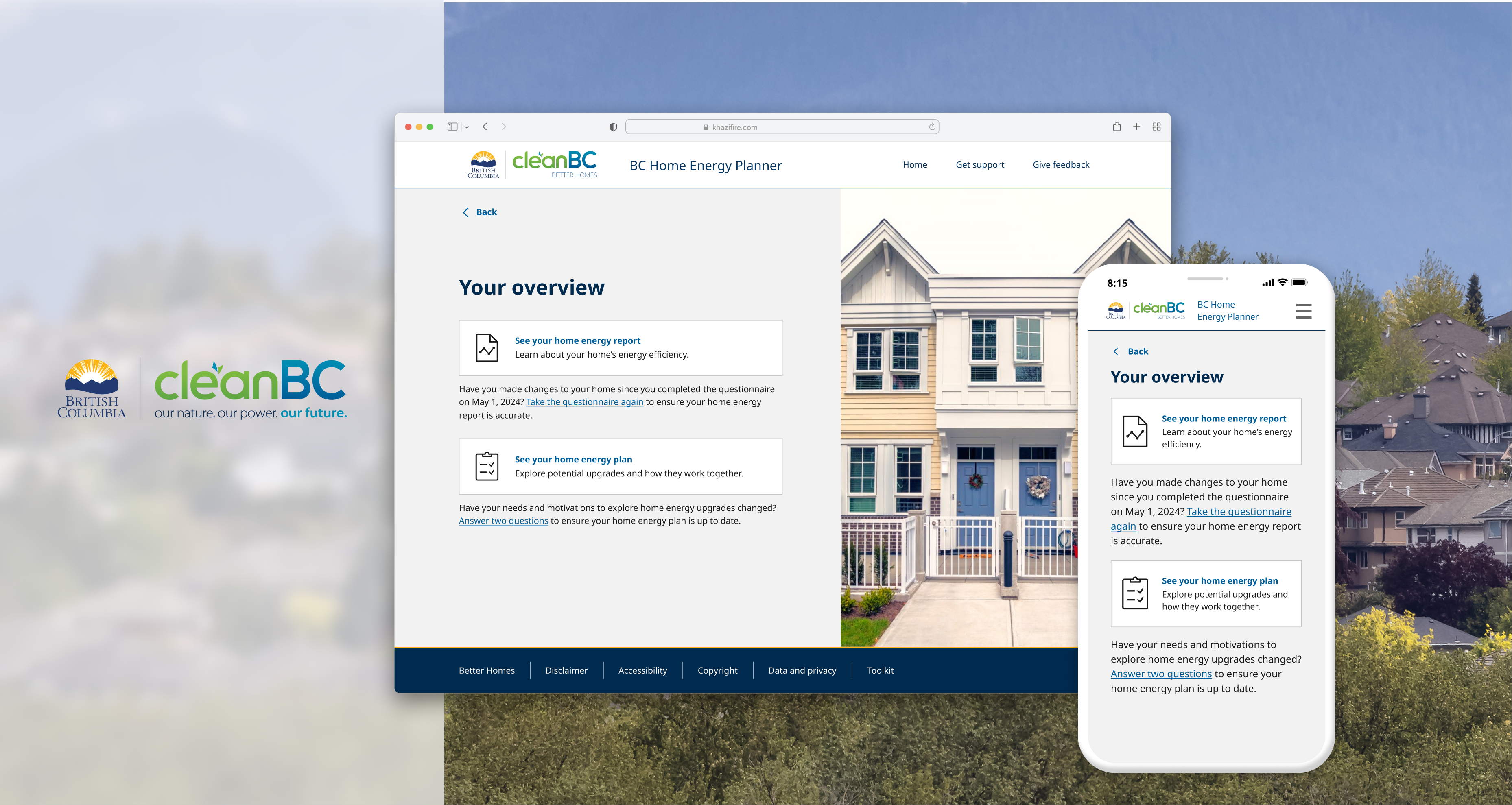
The BC Home Energy Planner is a government-backed, province-wide service that helps homeowners understand their home's energy performance and make informed decisions about improvements.
Built on Properate's existing energy modelling platform, I helped transform an expert-oriented system into a homeowner-first experience — from understanding a home's performance to deciding what to do next.
- Role
- Service Design Lead (0→1)
- Scope
- Product strategy · Service design · UX · Interaction design · Prototyping · Usability testing · Delivery
- Impact
- Province-wide · Available to BC’s 5.6M residents
- Context
- Government · CleanBC initiative
- Timeline
- July 2023 – Present
00 / Starting point
We didn't start with a blank canvas.
The BC Home Energy Planner was built on Properate's existing energy modelling platform — a system designed for multiple audiences, including homeowners, energy advisors, and institutional stakeholders.
Challenge
Turn that expert-oriented capability into a self-service experience homeowners could understand and act on.
Transformation
From an expert-facing assessment platform → to a homeowner-facing service.
- From Multi-user system To A homeowner-first entry point
- From Technical outputs To Actionable decisions
- From Insights To Rebate-aware, real-world next steps
A different audience, a different balance.
Properate's existing platform needed to serve both homeowners and energy professionals. Its direct path to energy insights and upgrades made sense for users who already knew what they were looking for.
For the Planner, we were designing for homeowners who might need more context before deciding what to do — but we couldn't add guidance at the cost of making the experience feel slower or more complicated.
This became our first design tension
Tension 01
How much guidance is enough?
The existing platform was designed to get users to energy insights and upgrades efficiently. For the Planner, we were designing for homeowners who might not be familiar with energy concepts and need more context to answer confidently.
This created a tension between directness and guidance.
Finding the balance
I considered how to provide context without turning the questionnaire into a learning exercise.
My decision
Designing the questionnaire around two needs
I kept the question as the primary task, while introducing contextual guidance alongside it.
This led to a split-screen pattern: the question remained the focus, while relevant educational content was available alongside it without sending users away from the assessment.
- LPrimary task (on the left): Clear question + instructions + answer choices
- RContextual guidance (on the right): Explanation + examples + visuals


The split-screen layout allowed users to access context without leaving the flow or interrupting the task.
The trade-off
I deliberately accepted some additional visual density in exchange for giving homeowners more confidence at the moment they needed to answer.
The goal wasn't to give users more information — it was to make the right information available at the right moment.
But making information available wasn't enough.
In the first version, the contextual guidance was presented through a relatively subtle "Learn more" treatment. During testing, users often overlooked it.
The problem wasn't that the information was missing. It simply wasn't noticeable enough.
Insight
If users don't notice the guidance, its value is effectively zero.
So rather than adding more educational content, I focused on making the existing guidance easier to notice and understand.
From "Learn more" → to contextual guidance

I changed three things
- 01 More visible Gave the explainer enough visual weight to compete with the primary task.
- 02 More specific Replaced generic "Learn more" language with a title directly connected to the question.
- 03 Progressive disclosure Provided enough context upfront while keeping deeper information behind "Expand."
The trade-off
I gave the explainer more visual weight, accepting a denser interface so users would actually notice the guidance.
The goal wasn't to add more information. It was to make the right information noticeable when homeowners needed it.
Tension 02
How do we make a complex system feel simple?
The Planner had to work within rules the interface couldn't change — from identity requirements to different user states and authentication outcomes.
The system could be complex.
The experience shouldn't have to be.
My role was to decide where that complexity should live: in the interface, or in the system logic behind it.
A Don't make users understand identity rules
When a system requirement becomes a user problem
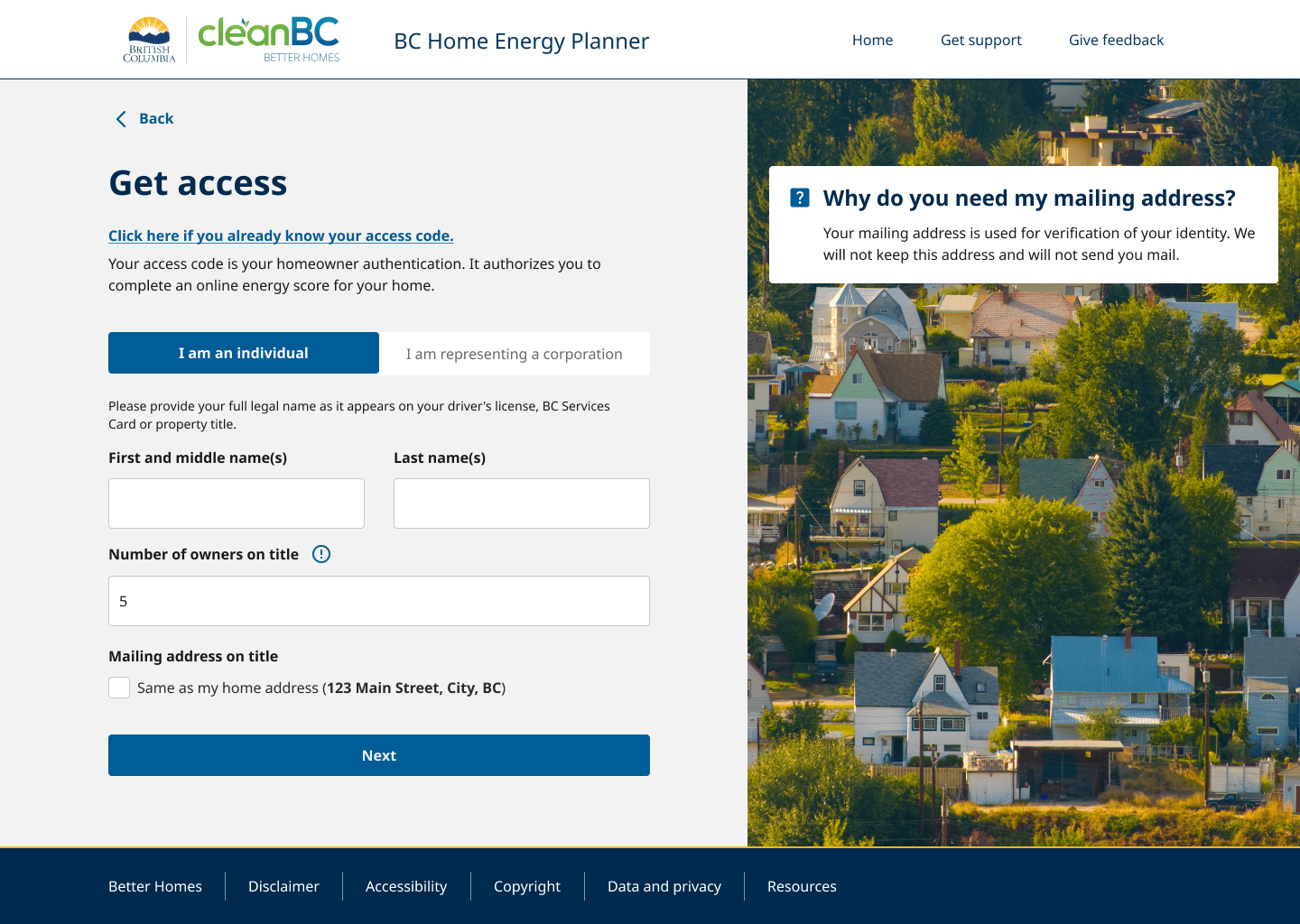
The original flow didn't explicitly ask for a middle name.
When the authentication requirements changed, we needed to collect users' full legal names, including middle names where applicable.
Instead of treating this as a simple form-field addition, I iterated on how the requirement should appear in the experience.

Three iterations


The trade-off
I accepted a slightly longer form to make an important authentication requirement harder to miss.
The challenge wasn't collecting more information — it was making the requirement clear enough to act on.
B Don't make users understand system states
Returning users
Once authentication was handled, another question emerged: what should a returning homeowner see when they come back?
The system knew exactly what state they were in. The user didn't.
Original design

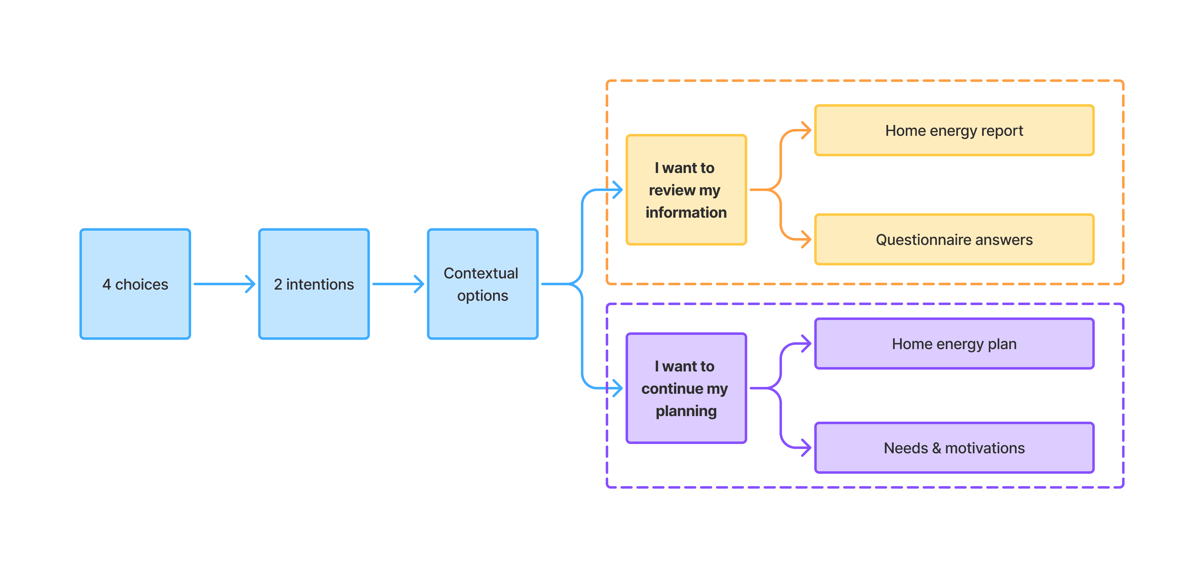
From destinations to intentions
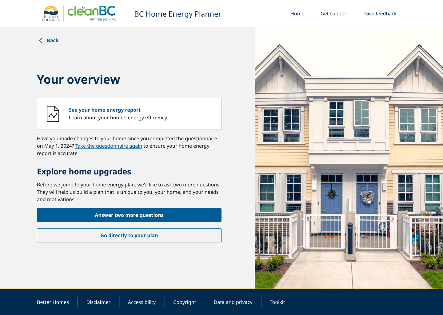
Instead of exposing every destination at the same level, I reorganized the experience around what users were trying to accomplish. The top level became intentionally simple, while the system handled the branching underneath based on the user's previous progress.
We redesigned the experience to guide returning users toward the most relevant next steps, reducing decision friction and making actions easier to prioritize.

The trade-off
I traded immediate access for clearer prioritization — keeping the same destinations while changing how users encountered them.
The added layer gave users fewer decisions to process upfront without limiting what they could access.
Impact
Outcome
The redesigned overview reduced decision friction and helped returning users confidently move forward.
Tension 03
How do we move users from understanding to action?
Our original hypothesis — Progressive disclosure
I intentionally separated the Report and Plan to gradually introduce complexity — helping homeowners understand their home before asking them to think about upgrades.

- Questionnaire
- ReportUnderstand
- MotivationsPersonalize
- PlanDecide
- RebatesAct
But the journey created an unexpected stopping point
- ReportUnderstand
- MotivationsPersonalize
- PlanDecide
Testing showed that some homeowners reached the Report and stopped there. The Report answered their immediate questions, but didn't always create a clear reason to continue.
The product goal wasn't just understanding
- Understand my home
- Choose an upgrade
- Get a rebate
- Improve my home
How might we reduce complexity without creating distance from action?
Then: challenge the original model
Should Report and Plan really be separate?
This wasn't just a usability issue. Our business goal was to help homeowners move from understanding their home to making upgrades, pursuing rebates, and taking action.
Before
Exploring: one continuous experience
- Understand
- Diagnose
- Decide
- Act
The trade-off
Separating the experiences made the journey easier to digest, but created a boundary between understanding and action.
The merged direction brings those stages closer together while keeping the experience structured through a clear information hierarchy.
Ongoing evolution
I'm currently exploring this merged model with the team. The goal isn't to show everything at once, but to make the progression from understanding → decision → action feel like one continuous journey.
Key learnings.
-
01 Clarity is not the same as simplicity
Simplifying the interface isn't always about showing less. It's about making the right information impossible to miss.
-
02 Good hierarchy reduces decision friction
When multiple actions are valid, the role of design is not to remove choice — but to make the path through those choices clearer.
-
03 A successful journey connects understanding to action
Progressive disclosure can make complexity easier to digest — but if the next step feels too far away, users may stop before taking action.
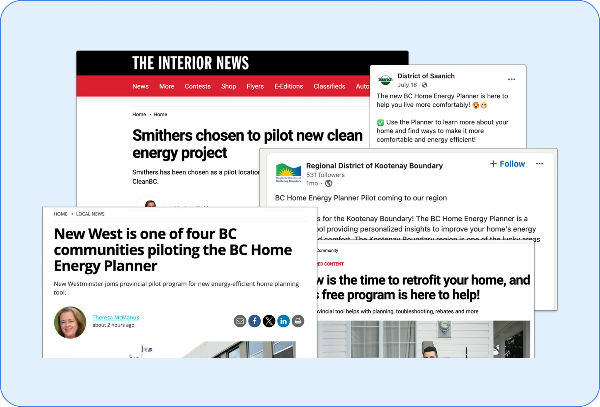
The pilot program has been tremendously successful, validating its value to homeowners, and granting us important opportunities for us to improve the tool prior to its provincial launch.