Roux HQ — Sophia Tang
Sophia Tang Side project

Side project 02/Roux HQ/Family app · Client work

Life with little ones.

A family app organized around the child — not around the app

Role
Product designer — solo
Client
Hannah Mercier — founder, new parent
Scope
IA · UX/UI · Design system · Copy · 55 frames
Timeline
Oct – Dec 2025 · 2 months
Status
Design delivered · handed to development
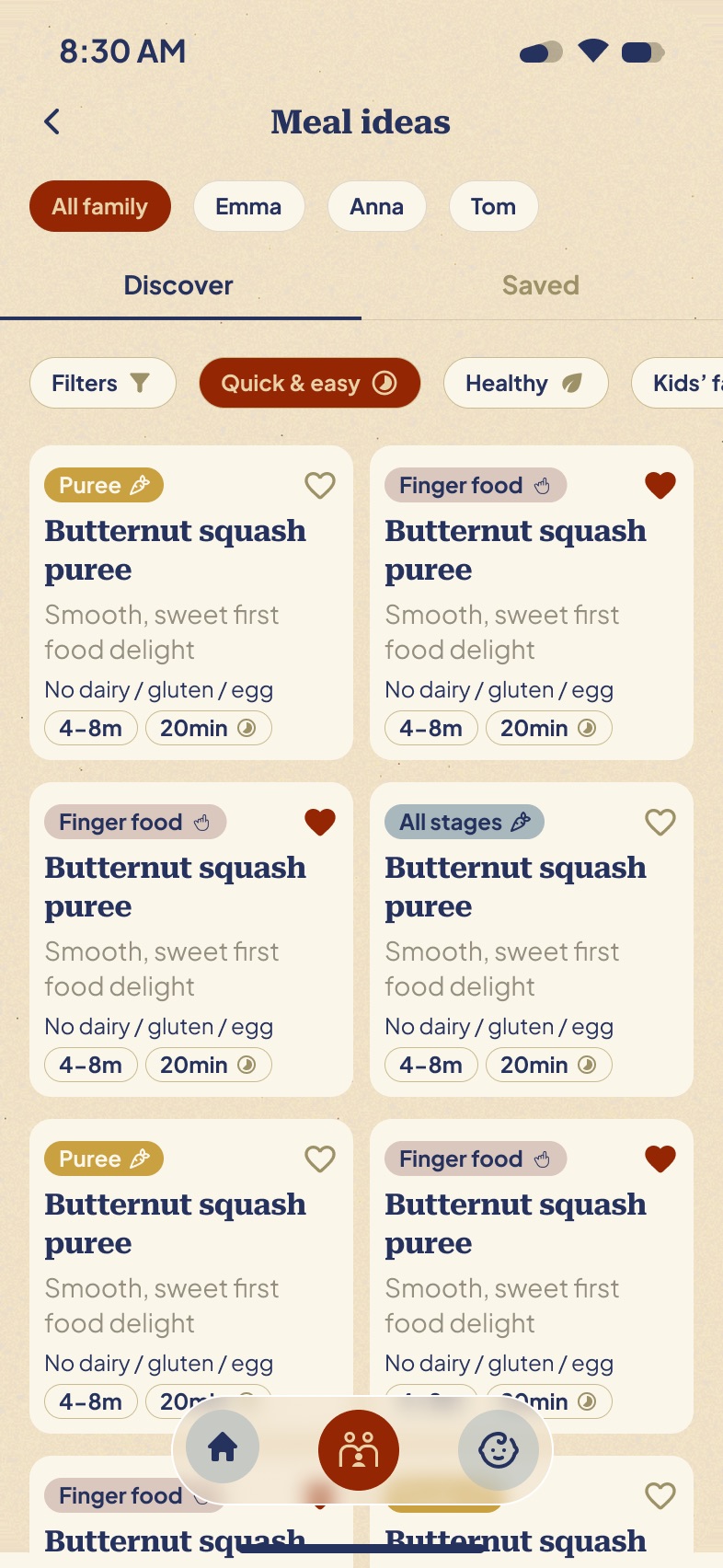
Roux HQ meal ideas library, filtered per child
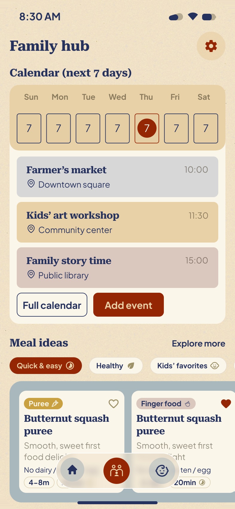
Roux HQ home screen showing today's activities and meal inspiration
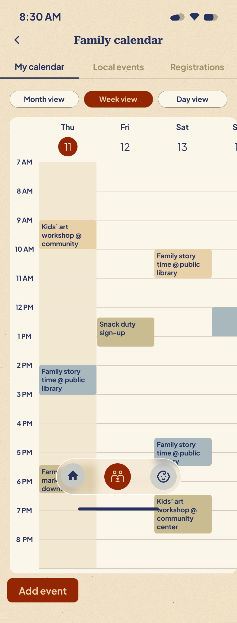
Roux HQ week view with colour-coded family events
Roux HQ — meal ideas, today, the weekFig. 01

01 / Why

A problem my client was living in.

Hannah Mercier had just become a mother. She went looking for one app that could hold the whole of family life — the activities, the meals, the milestones, the endless registration deadlines — found nothing that did it, and decided to have it built.

Somewhere in that first conversation we worked out that our children had been born on the same day of the same year — a coincidence, but a useful one. I didn’t have to imagine this user.

So the project never had a discovery phase. It had two parents who already knew the problem by heart, and a standing review every week.

Plenty of parenting apps exist. None are organized the way a parent thinks.

  • 01 Trackers organize by data type Sleep in one tab, feeding in another. Useful for logging, useless for deciding what to do with the afternoon.
  • 02 Calendars organize by time One undifferentiated column for the whole household. Three children's lives arrive as a single wall of blocks.
  • 03 Recipe and activity apps organize by content Excellent libraries that don't know your child exists — not their age, not their allergies, not what they liked last week.

A parent doesn't think in data types. A parent thinks: what does Hugo need today?

02 / The bet

One calm place, organized around the child.

  1. 01 Every list narrows to one child The same control, in the same place, on every surface that holds a list. Learned once, then free forever.
  2. 02 Home shows today, not everything One decision per section. The libraries stay one tap away and stay out of the way.
  3. 03 The product has a voice So a suggestion reads as advice from someone who has done this before — not as a query result.

03 / Structure

Three tabs, three questions.

The tab bar has three items and never grew. Each answers a question a parent is already asking, in the words they'd use to ask it — so nothing sits more than one tap from the question it answers.

  • Home tab
    Home What's today? A single day, already decided: one activity, one meal, what's coming next.
  • Family hub tab
    Family hub When is it? Seven days at a glance, the full calendar underneath, and the deadlines nobody remembers.
  • Kids tab
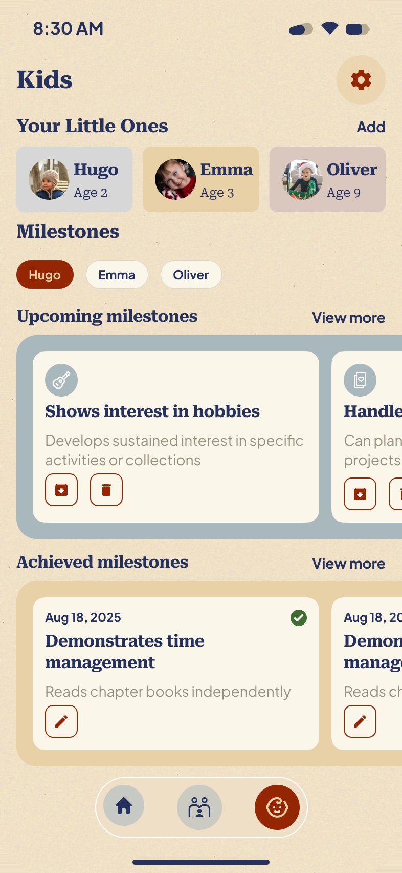
    Kids Who is it for? One child at a time — their milestones, their profile, what they're growing into.

One piece of setup, five payoffs.

Onboarding asks four things per child — name, nickname, birthday, allergies — and never asks again. The birthday decides which milestones surface. The allergies quietly filter every meal suggestion. And the name becomes a chip: the same control, in the same position, on five different surfaces.

Onboarding Let's meet your family! name nickname birthday allergies
Hugo Emma Oliver

The child chip — defined once

  • Milestones filtered by child
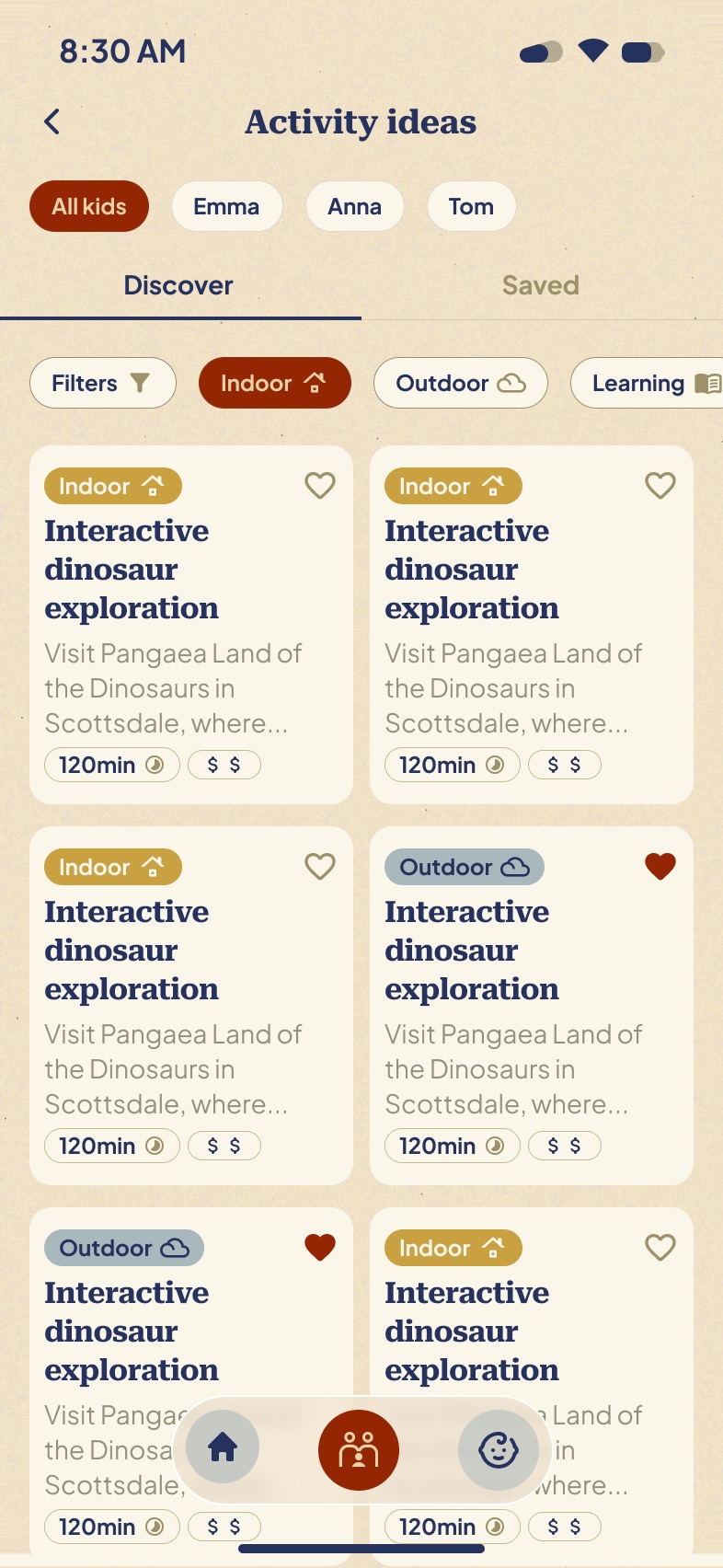
  • Activity ideas matched to age
  • Meal ideas screened for allergies
  • Registrations whose deadline
  • Calendar colour per child

04 / Moments

Four decisions worth defending.

Home01 / 12

Moment 01 — Today, not everything

The home screen is a single day.

Weather, one activity, one meal, and what’s coming. Every other screen is a library; this is the one screen that makes a decision on your behalf — and it names the reason out loud: “Perfect for Hugo (age 9) on a cozy morning.” Naming the child turns an algorithm into attention.
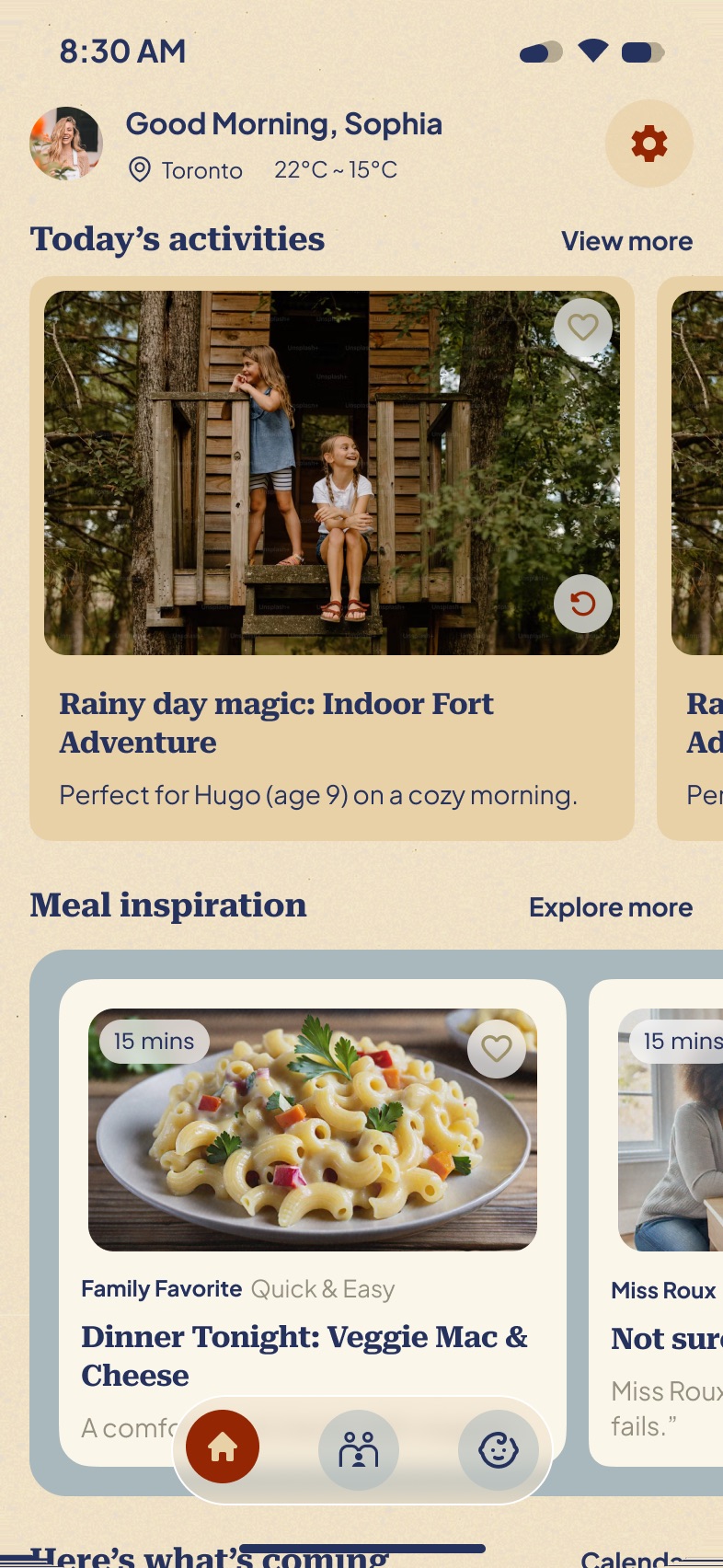
Home

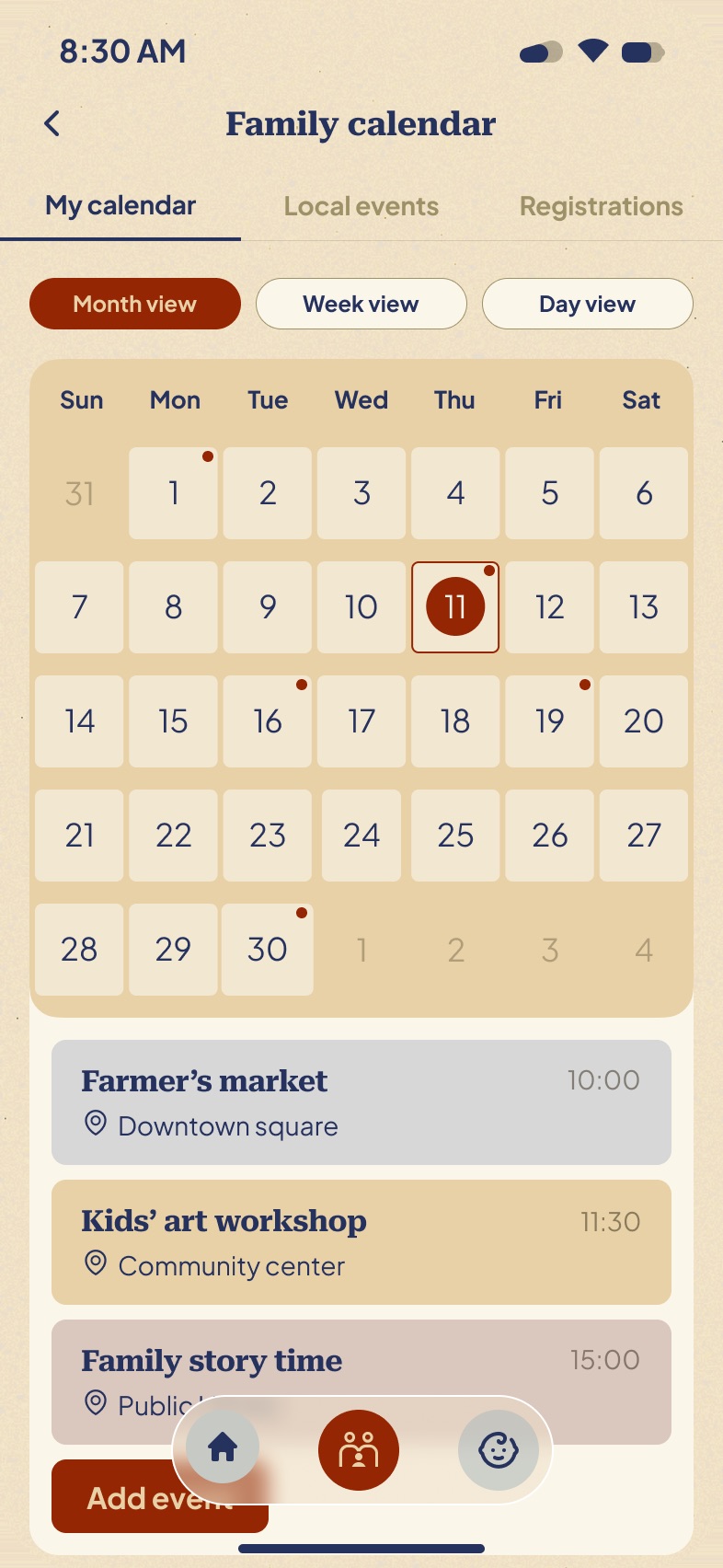
Moment 02 — Two kinds of time

A family calendar carries two very different things.

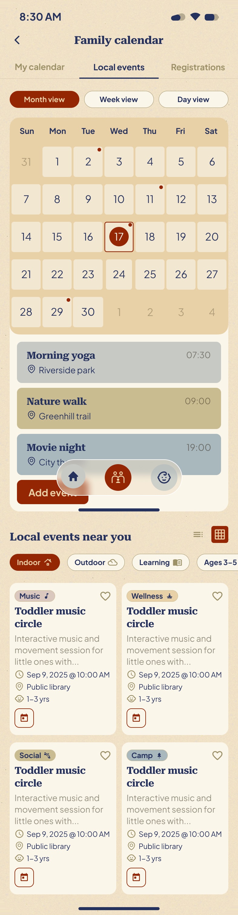
The first is what you have already committed to. This is the calendar you trust — if it is on here, it is happening, and someone in the house has to be there.

My calendar

The second is what’s happening nearby that you haven’t.

Toddler music circles, library story time, the farmers’ market. Mixing possibilities into a calendar of commitments is how you end up with a calendar you stop believing — so they are separate tabs over the same grid. Same dates, same colours, completely different contract.

Local events

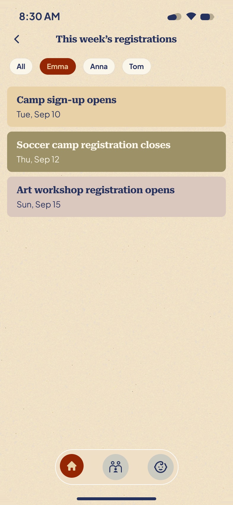
And the deadline nobody models.

Not when the thing happens — when signing up opens and closes. Camp sign-up opens Tue Sep 10. Soccer registration closes Thu Sep 12. This is the class of deadline that costs families a whole season, and no calendar app carries it, because it isn’t an event.

Registrations

Moment 03 — Celebrate, don’t assess

Development tracking is one wrong word from a report card.

Upcoming milestones sit above achieved ones — a horizon, then a record. There is no progress bar anywhere in this flow, because a progress bar implies a schedule a child can fall behind. Even the empty state refuses to be clinical: “Start tracking your child’s growth journey. Add milestones to celebrate every achievement.”

Kids — milestones

Moment 04 — The voice

She gave me a character. I gave her a voice.

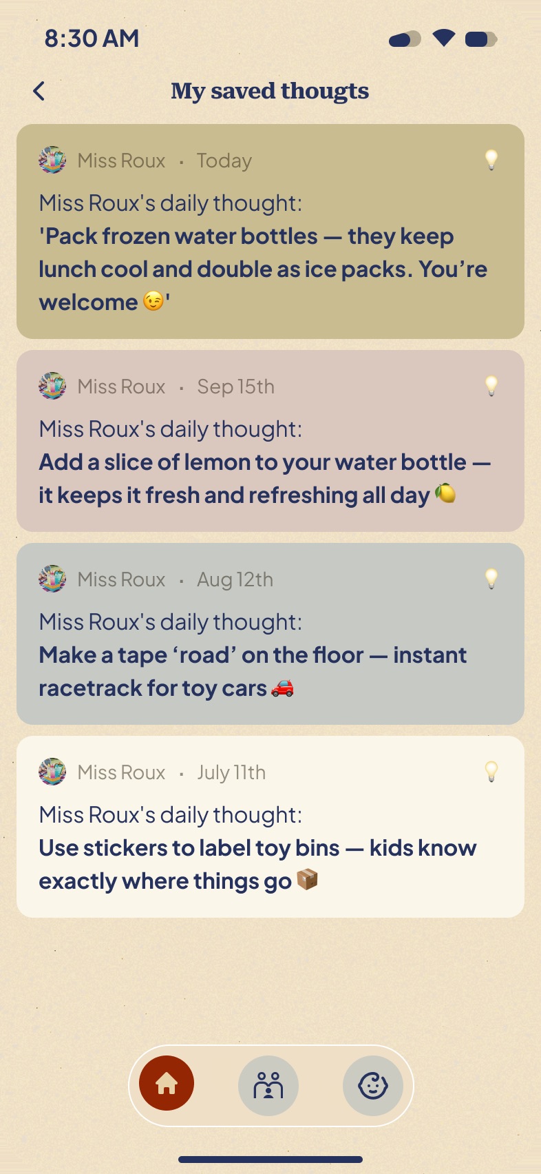
Miss Roux was Hannah’s — the name, the character. What the product needed was a register. I wrote every daily thought in it: one per day, one sentence, always something you can do this afternoon. Never a question, never congratulations.

  • Make a tape ‘road’ on the floor — instant racetrack for toy cars 🚗
  • Pack frozen water bottles — they keep lunch cool and double as ice packs
Miss Roux

05 / The brief

The brief was two words.

Warm and inclusive.

That was the whole visual direction. A logo is not a product language — what I had to work out was how a circus tent becomes an interface you look at one-handed at six in the morning.

Hannah brought
  • The name — Roux HQ
  • The logo — the tent
  • Miss Roux, the character
  • Two words of direction
I decided
  • The palette and how each colour is allowed to be used
  • The type pairing and the whole hierarchy
  • The information architecture and the interaction model
  • Every component, every state, all 55 frames
  • Every word of copy, including Miss Roux's voice

Every colour has one job.

  • #EFE1C6 Paper The ground. Warm enough to read as home, light enough to live with all day.
  • #FAF6E9 Card One step up from the ground. The only elevation the product uses.
  • #E8D1A7 Sand Grouping. The tray that holds a set of things that belong together.
  • #942603 Brick The one primary action per screen. Nothing decorative is ever allowed this colour.
  • #27335F Navy All type. Not black — black reads clinical against a warm ground.
  • #C9BC90 Olive Calendar category.
  • #A8B8B8 Slate Calendar category.
  • #D8C0B8 Rose Calendar category.

The last three exist for one screen: week view, where several children's schedules stack in the same column. They're desaturated to within a hair of each other on purpose — no child's day should look louder than another's.

Warm is easy to overshoot into childish. Three rules kept it honest: brick appears once per screen and always belongs to the thing you're meant to tap; a bookish serif carries every heading, so the product reads as written rather than generated; and a paper grain sits under everything, which is what stops warm from turning into plastic.

06 / The system

Six patterns, fifty-five frames.

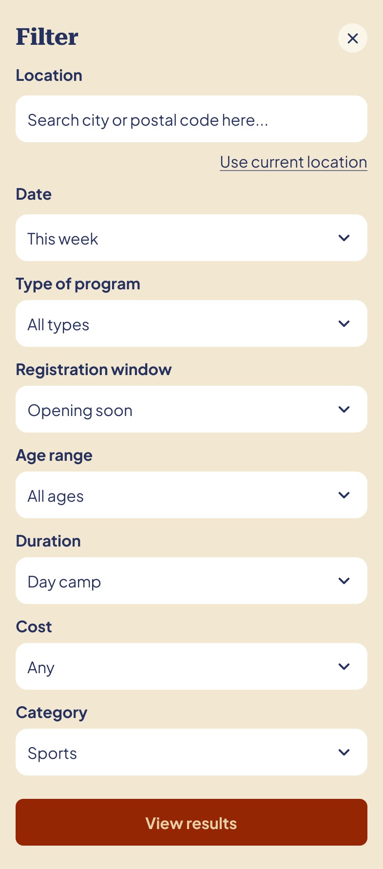
Two months is not enough time to invent a new pattern per screen, and a product this broad can't afford one anyway. Six components carry the entire app. Everything below is cropped from a delivered screen, not redrawn for this page. The states those patterns produce come next.

  • Activity card
    The card Image, tag, title, one line of reason. Every content type in the product is this card with different metadata.
  • Child chip row
    The child chip The structural primitive. Same order, same position, five surfaces. Selected state is the only brick on screen.
  • Filter chips
    Filter chips Horizontally scrolling, never collapsing into a menu. Visible filters are filters people remember to turn off.
  • Bottom sheet
    The bottom sheet Anything that modifies the current view arrives from the bottom and leaves the view visible behind it.
  • Empty state
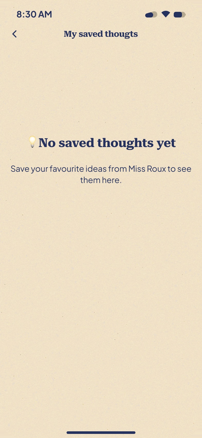
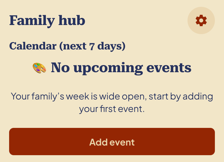
    Empty states Never apologetic, never blank. A sentence about what will live here, then the one action that starts it.
  • Tab bar
    The tab bar Three items, floating, permanently visible. It never grew past three, which was the hardest thing to hold on to.

And the states they produce.

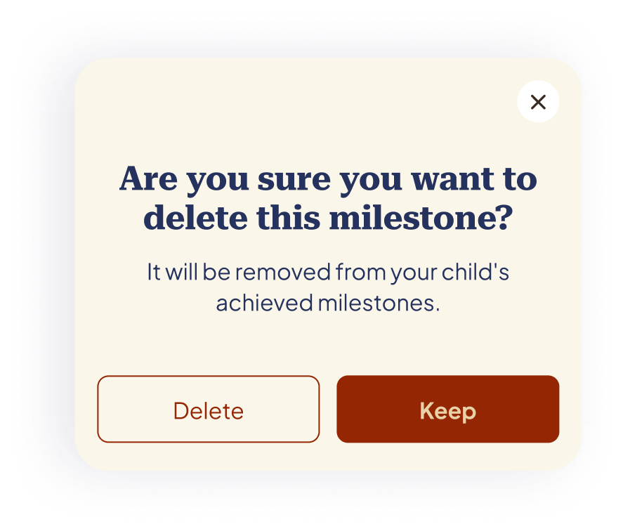
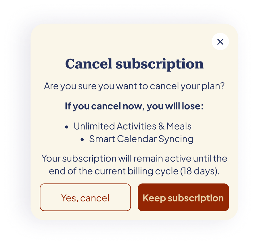
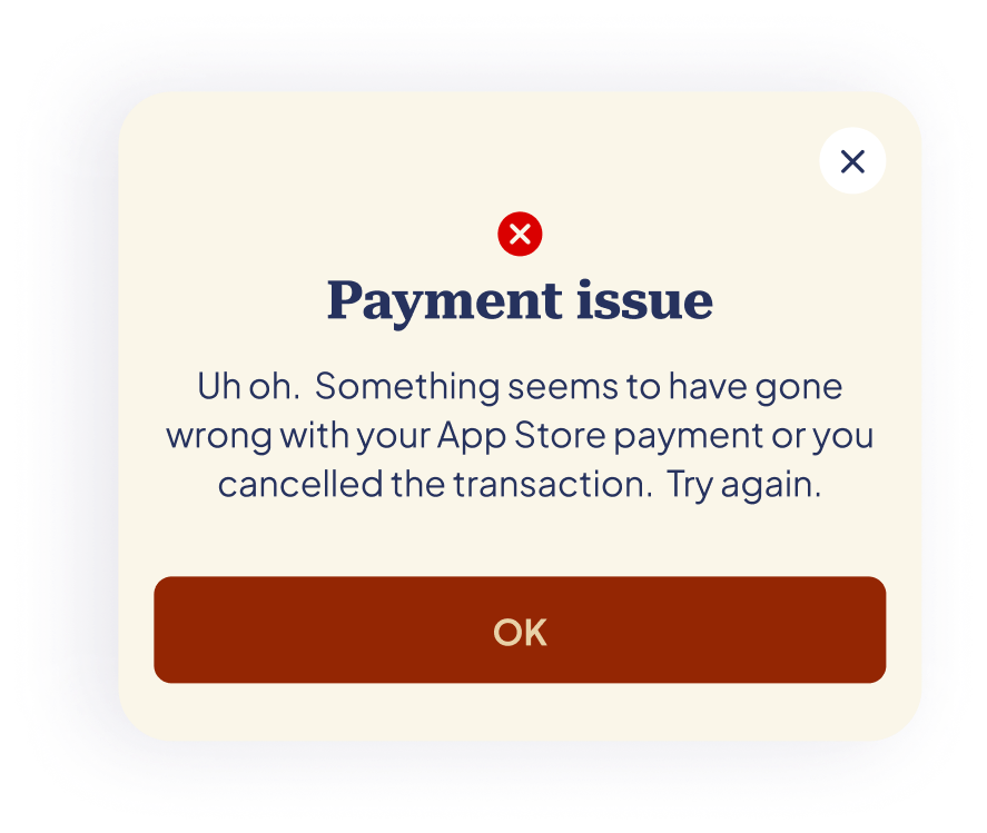
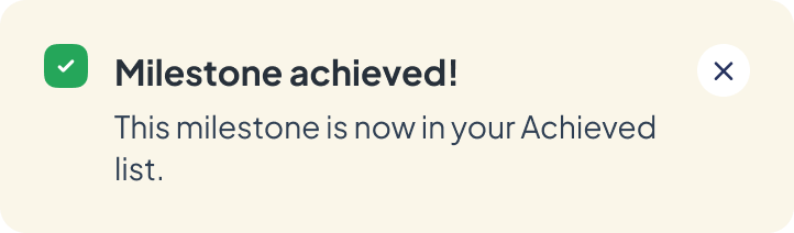
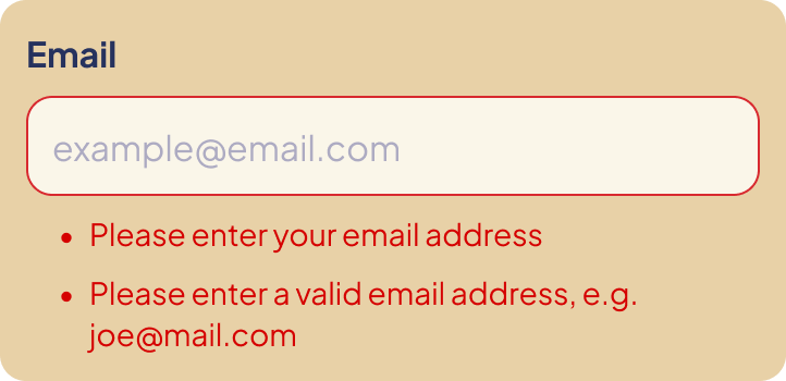
Twenty-one more frames exist only when something is saved, deleted, cancelled, mistyped or still empty. Six of them here, because they carry the one rule I'd defend hardest: every confirmation puts the destructive action in an outline and the safe action in solid brick.

Delete sits quietly beside Keep; “Yes, cancel” beside “Keep subscription”. In a product built on a record of what your child has done, the default has to be keep. Toasts never congratulate you — they say where the thing went. Errors give an example rather than a rule. And nothing is ever just blank.

  • Delete milestone confirmation, with Keep as the primary buttonDelete / Keep
  • Cancel subscription dialog listing what is lostCancel / Keep subscription
  • Payment issue dialogPayment issue
  • Milestone achieved toastMilestone achieved
  • Inline email validation errorsField-level errors
  • Family hub empty calendar stateEmpty calendar

07 / Every screen

Every screen in the delivered file, grouped by the flow it belongs to. Each row scrolls sideways — use the arrows, drag it, or let it drift as you scroll. Hover a long screen and it scrolls itself; click any of them to open it full size.

01Getting in & set up 10 screens
02Today, meals & activities 9 screens
03Time, milestones & Miss Roux 15 screens

08 / Handoff

Delivered, then handed over.

No kickoff deck, no research phase, no stakeholder map. We talked often, I posted work on a fixed cadence, and Hannah left her comments directly on the frames in Figma.

My client was also my user — so every review was a usability test, just an unusually honest one. Worth naming the limit too: one deeply informed user is still one user. A second parent would have disagreed with something on this page.

  • 2 months
  • 34 screens
  • 21 states
  • 1 prototype
On outcomes

The designs and the prototype were delivered in December 2025. Hannah took them to a development team; the build isn't mine and I don't have usage data. So there are no metrics on this page — only decisions, and the reasoning behind them.

What I'd want to know

  • 01Does the local-events tab earn its place, or is it a content problem wearing a feature's clothes?
  • 02Is Miss Roux still charming on day sixty, or only on day one?

What it taught me

Writing the copy is the design. I couldn't work out what Miss Roux should be until I'd written thirty of her thoughts and thrown most of them away — and designing for a household turned out to mean designing for a group that shares one login. Almost every hard decision came from that, not from the feature list.

Walk the prototype Back to beyond work