xPass+ — Sophia Tang
Sophia Tang Side project

Side project 01/xPass+/NFT tours · Client work

NFT tours, reimagined.

An audio guide to real places, and the tokens that belong to them

Role
Product designer — solo
Client
Jonathan Wang — tour operator, NFT collector
Scope
IA · UX/UI · Visual system · Copy · 82 screens
Timeline
Jan – Apr 2023 · 4 months
Status
Design delivered · built by the client's team
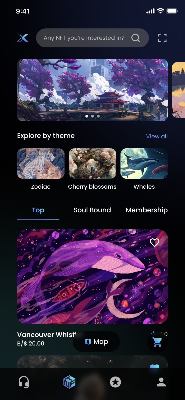
xPass+ NFT marketplace, browsable by theme
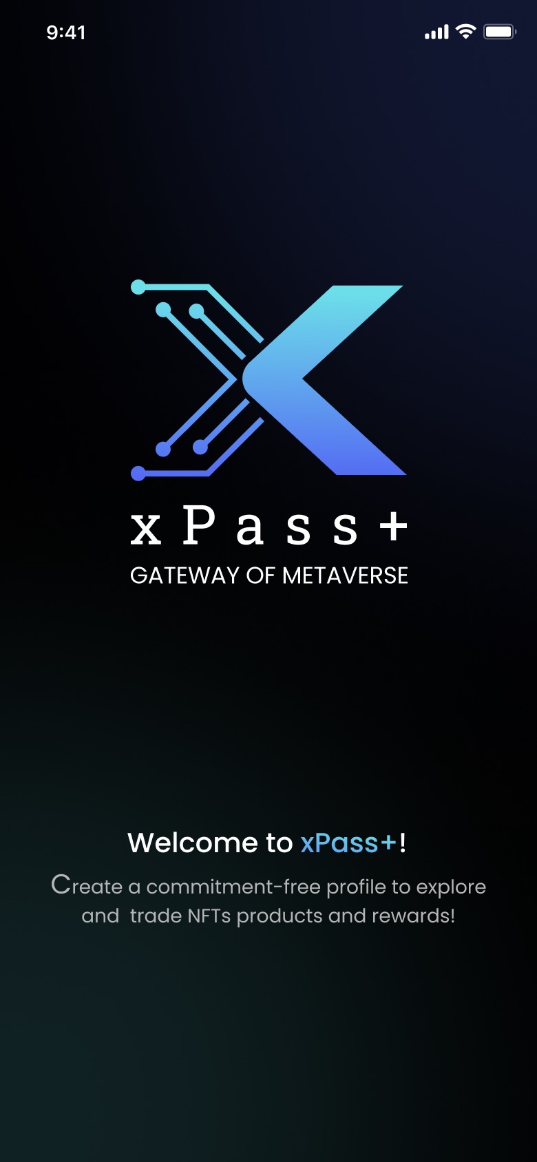
xPass+ welcome screen — gateway of metaverse
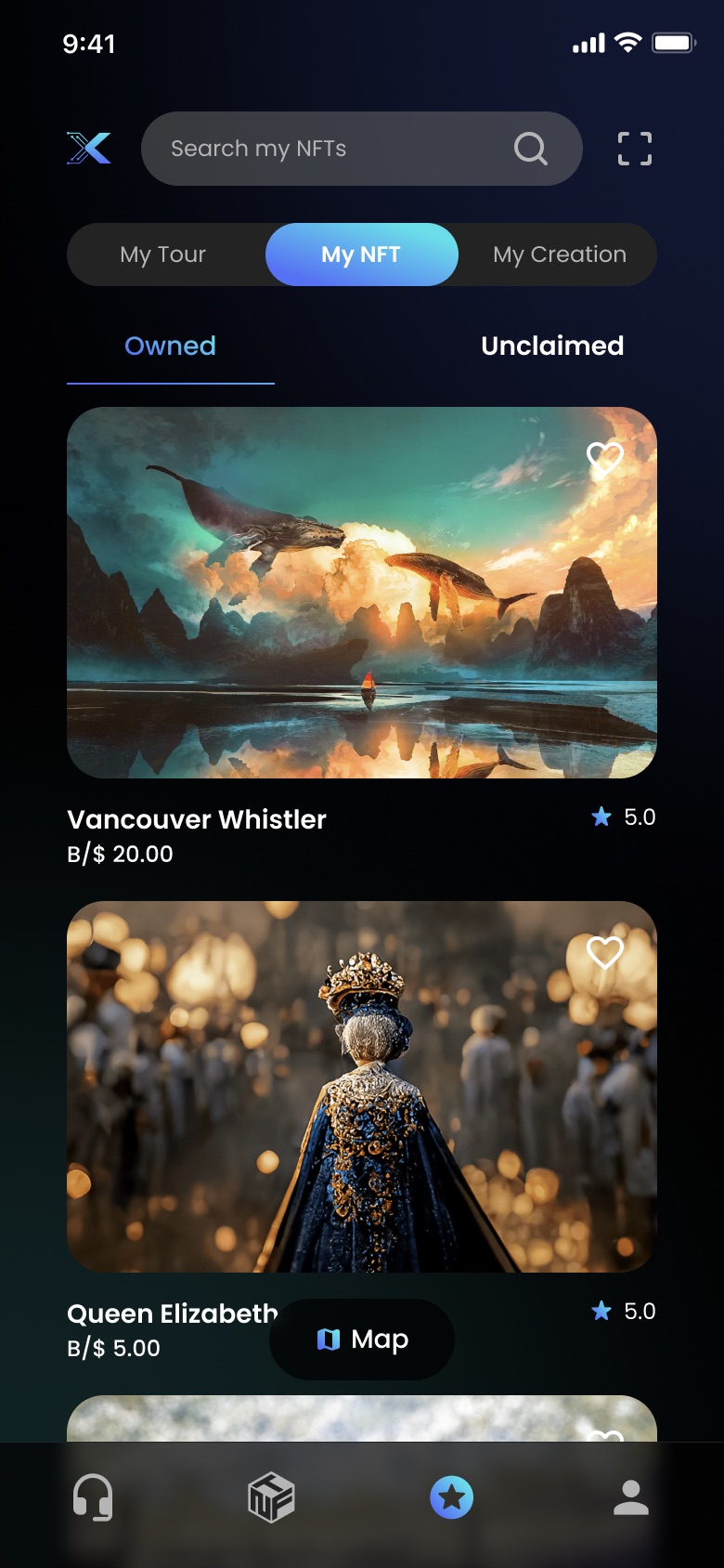
A collector's owned NFTs
xPass+ — the marketplace, the gateway, the collectionFig. 01

01 / Why

A client who already owned both halves.

Jonathan Wang runs tours, and collects NFTs. So this project never started from a technology looking for a use — he had a travel business on one side and a wallet on the other, and wanted to know what happened if you tied them together.

I had never owned an NFT. During the project he walked me through unlocking my first one — which turned out to be the most useful thing that happened, because it made me the product's actual first-time user.

Every screen where the wallet needed to get out of the way, I found by being confused by it first.

In early 2023, most NFT products asked you to care about the token.

  • 01 The asset was the product Buy the picture, hold the picture, hope. Nothing in the experience gave the thing a reason to exist beyond resale.
  • 02 The vocabulary was the gate Wallets, gas, chains, minting. Every one of those words is a place where someone who just wants to visit a park gives up.
  • 03 Nothing was anywhere A token that lives only in an app can only ever be worth what the next person will pay. It has no other claim on you.

Jonathan's version had a way out of all three: the token points at somewhere you can go and stand.

02 / The pairing

Every token carries a street address.

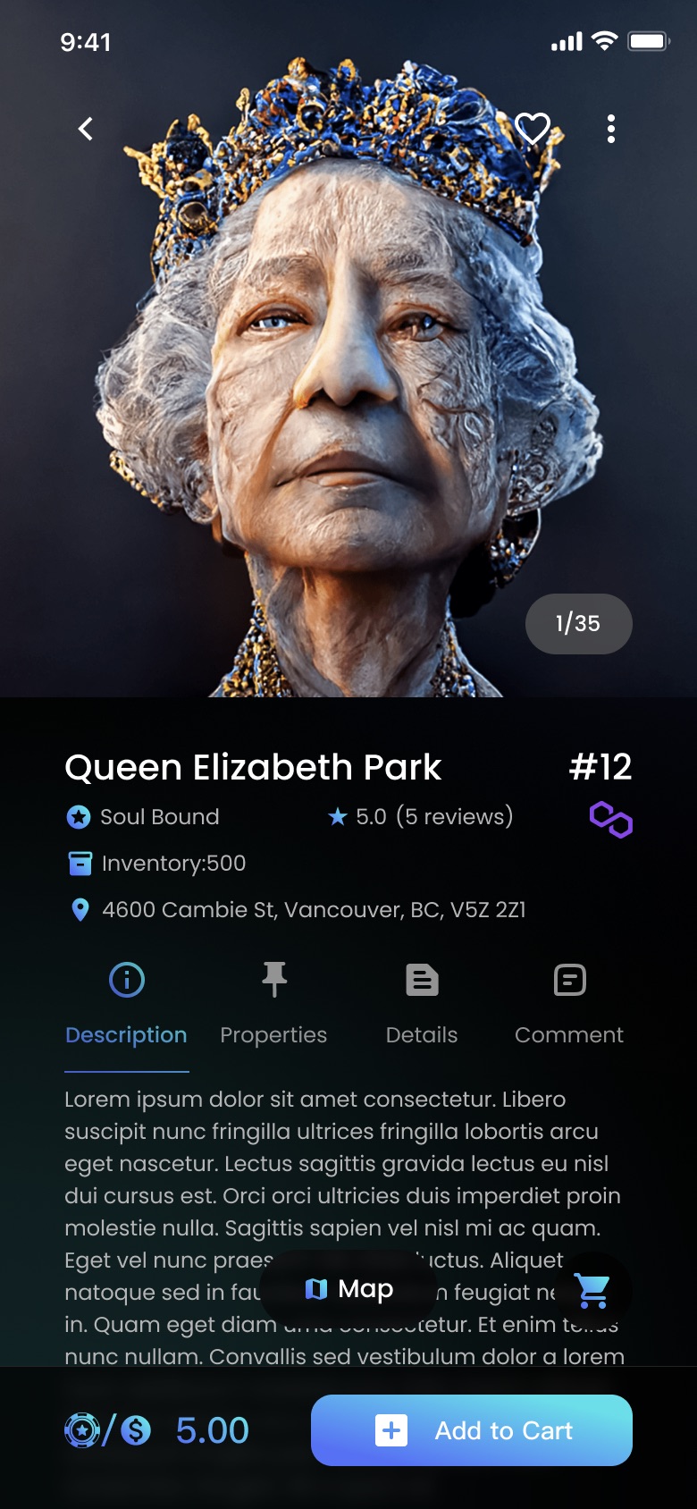
Queen Elizabeth Park NFT detail, showing a real Vancouver street address

The detail page has to be two things at once: a marketplace listing, and a place you can go and stand in.

It carries the listing — edition #12, an inventory of 500, a Soul Bound classification, a rating, and a price written in both currencies. And it carries a location: 4600 Cambie St, Vancouver. That address line is the whole premise of the product compressed into one row.

The stacking order is the design. Title and edition, then the chain facts, then the address, then a four-tab body — Description, Properties, Details, Comment — so marketing copy, token attributes, practical logistics and other people's opinions never compete for the same block of space. Price and Add to Cart stay pinned through all four tabs, because the decision doesn't change when the tab does.
  • 01 Everything has coordinates So the map isn't a feature buried in a tab. Every list in the product has a map twin, one tap away.
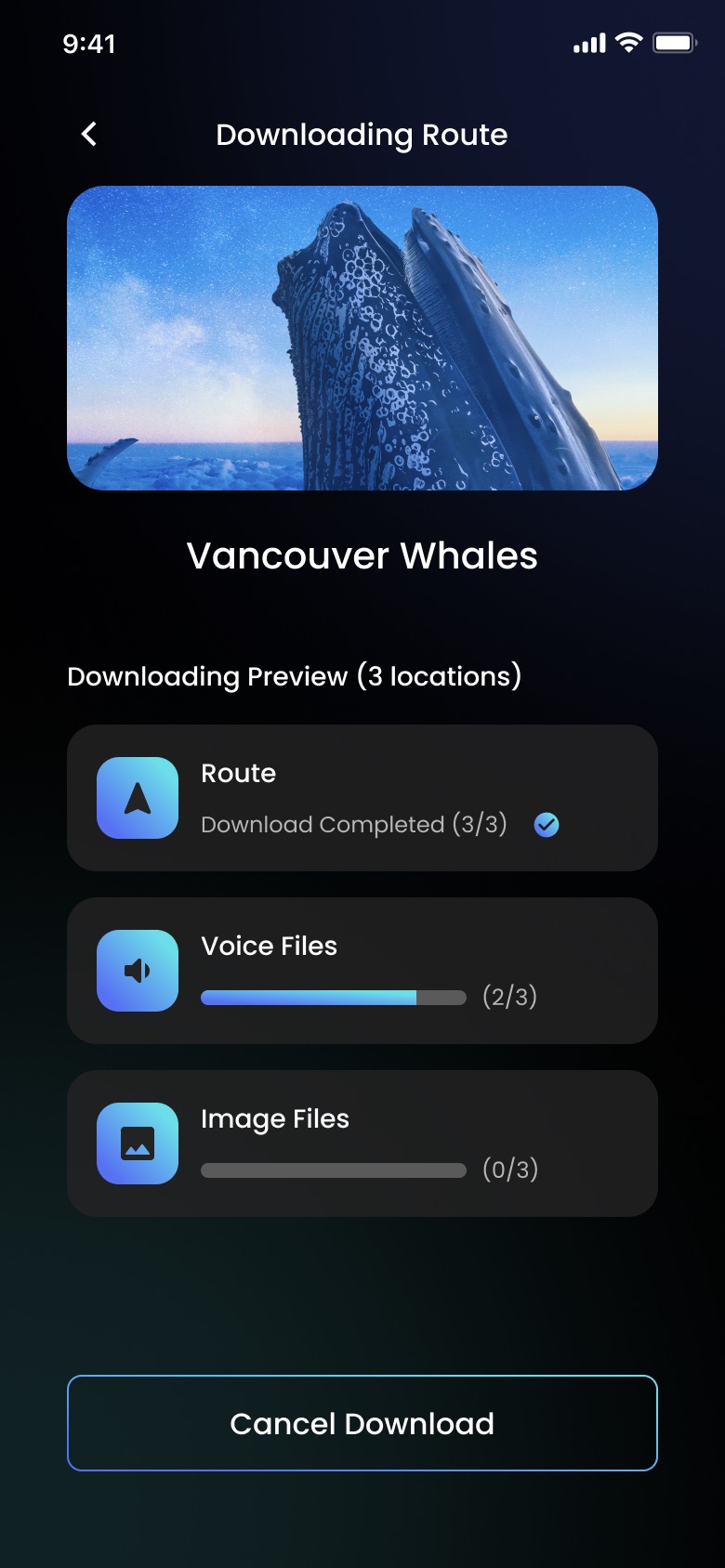
  • 02 A tour is a package, not a stream You download the route before you go, because the moment you need the guide is the moment you have no signal.
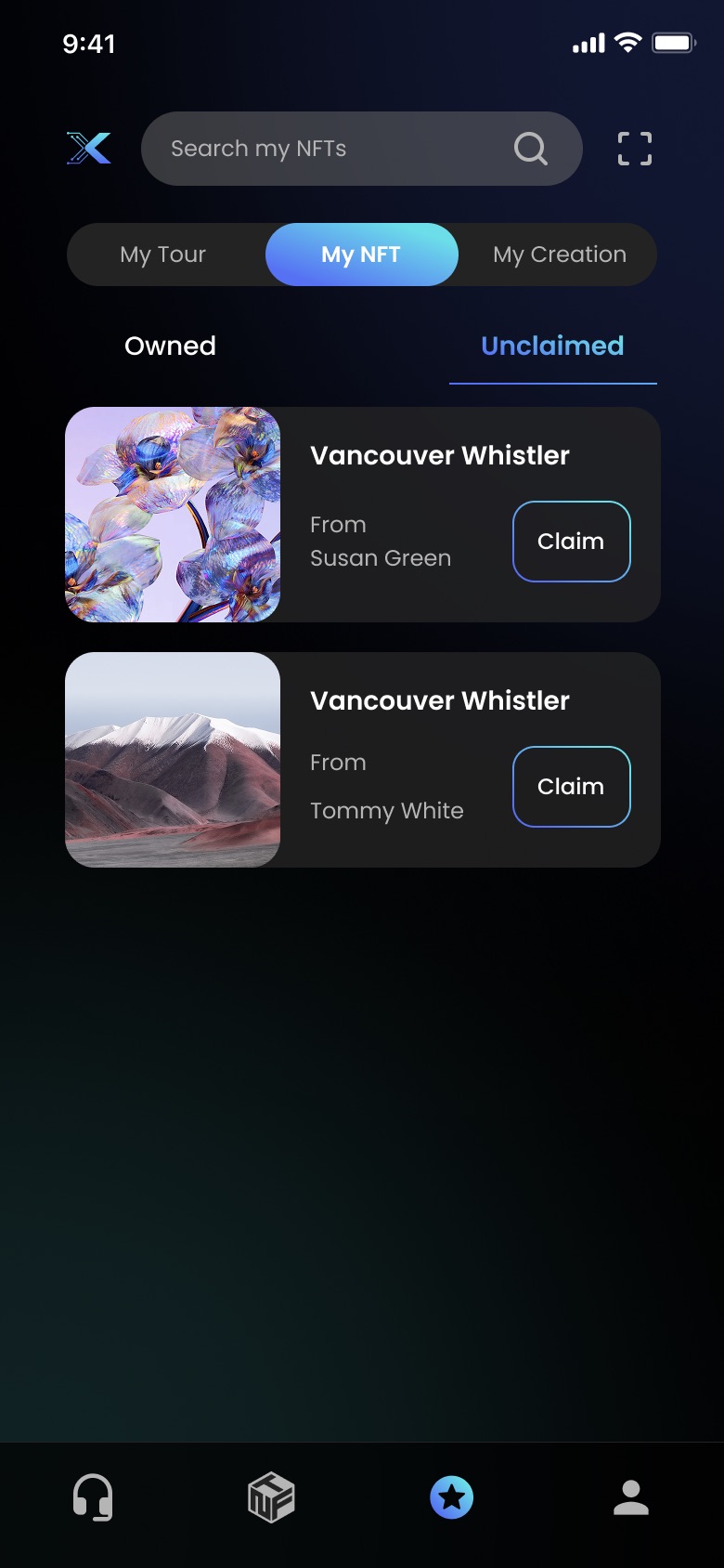
  • 03 Ownership has three states Owned, unclaimed, and made by you. A gift you haven't opened yet is a state the interface has to name.

03 / Moments

Four decisions worth defending.

Home01 / 07

Moment 01 — The headphones come first

The default tab is the guide, not the marketplace.

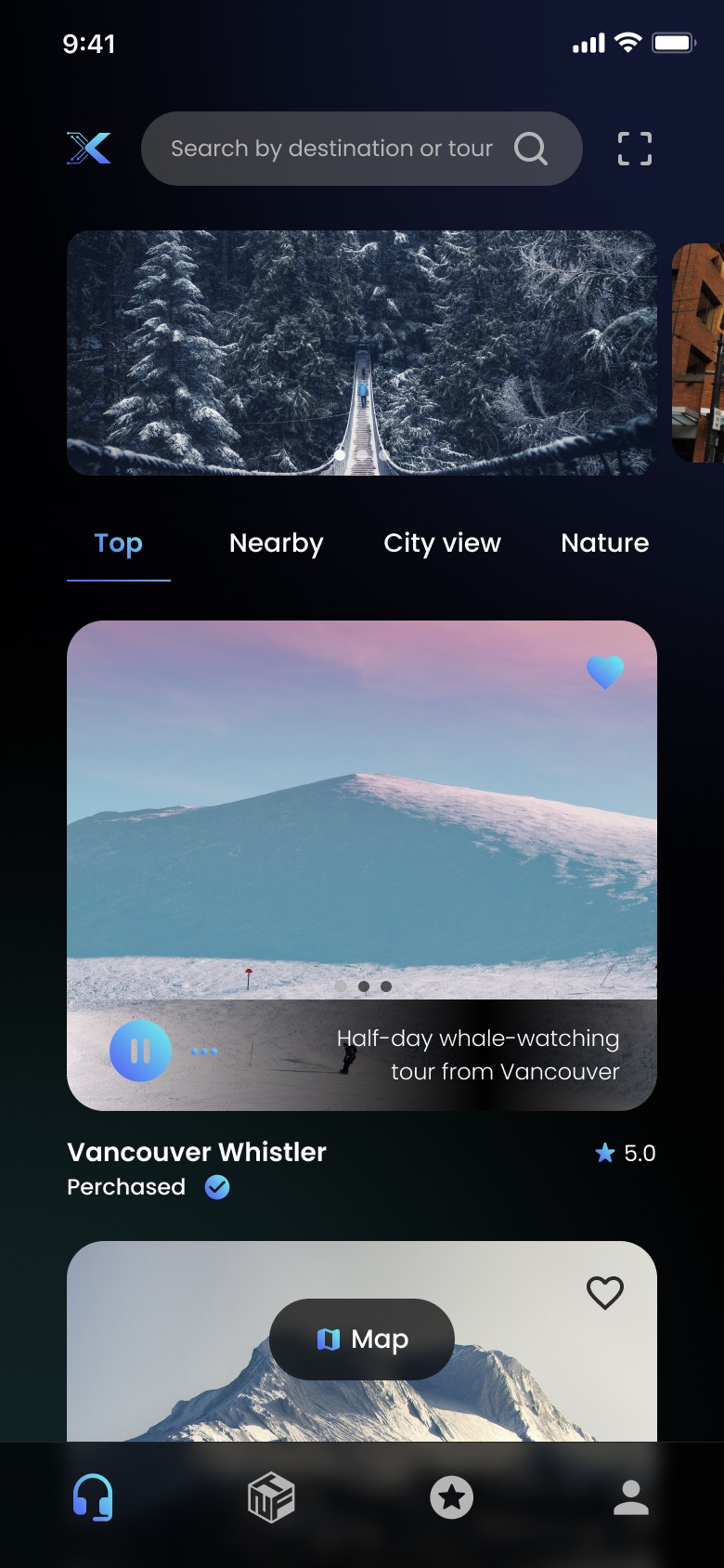
Four tabs: headphones, the NFT cube, favourites, you. The app opens on headphones. You arrive in a product about going places, and the tokens are one tab over — which is the correct order of operations for someone who has never held one.

Home — audio guide

Moment 02 — A tour is a package

Everything you need to commit, before you commit.

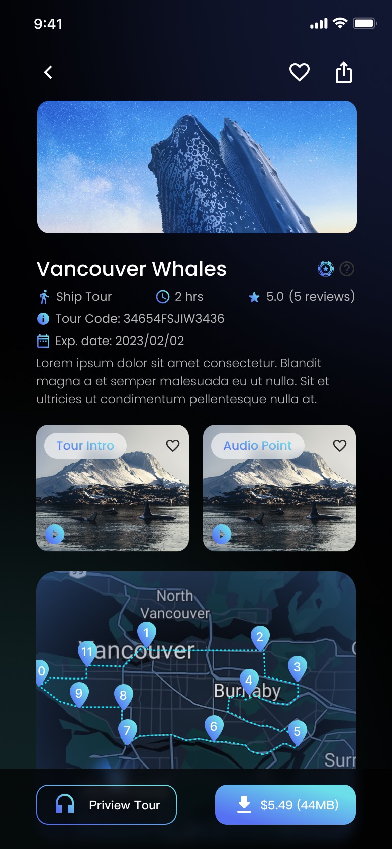
Ship tour. Two hours. A tour code, an expiry date, a rating. Then a Tour Intro you can play for free and the Audio Points that make up the route, drawn as a dashed line between numbered stops so you can see the shape of the walk before you buy it.

Tour detail

The download button carries a price and a size.

$5.49 (44MB) — two numbers on one button, because both of them are decisions. The moment you need a guide is the moment you're underground, or on a mountain, or out of data. Streaming was never an option; the route comes with you.

Download route

Moment 03 — The map is a peer, not a page

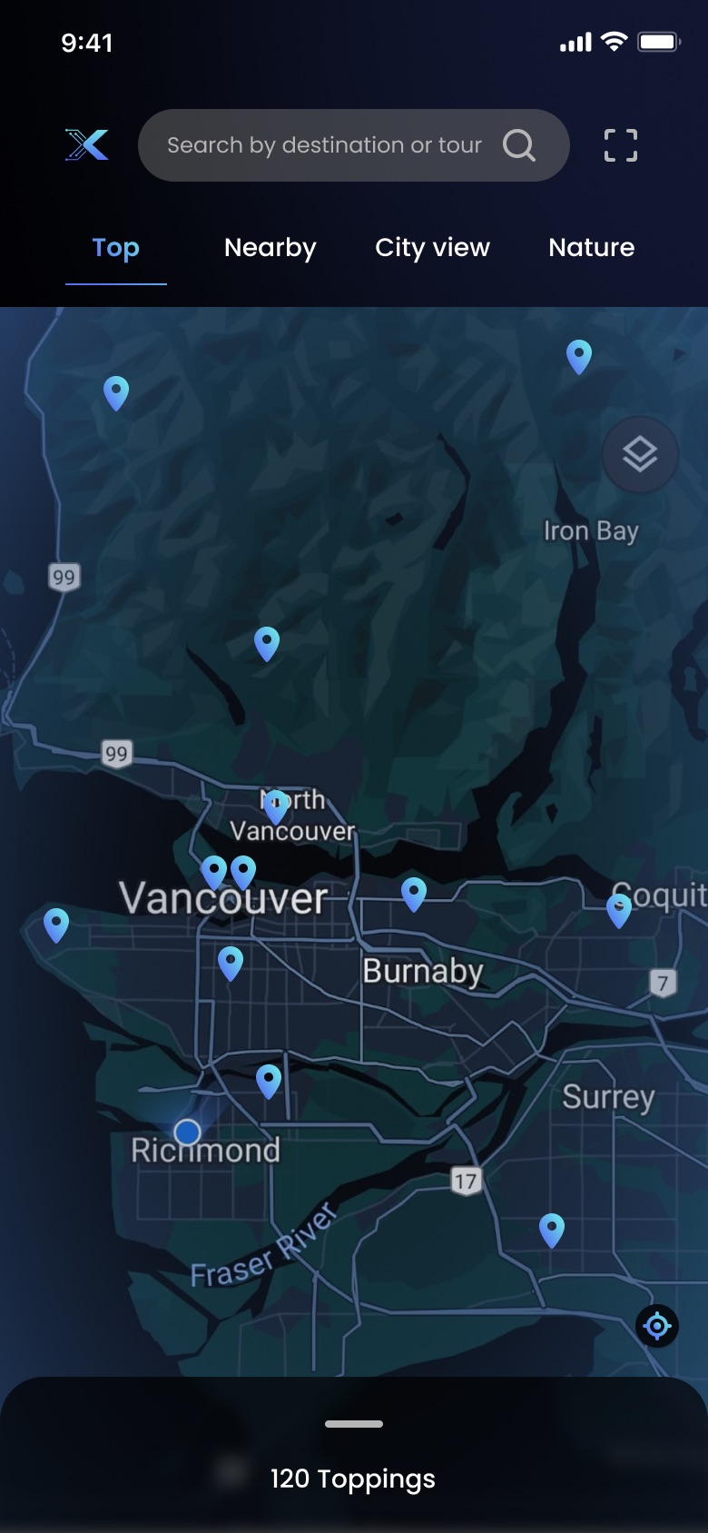
Every list has a map twin.

The same filters sit above both — Top, Nearby, City view, Nature — so switching to the map is a change of view, never a change of place. The map is styled into the product's own dark palette rather than dropped in as a bright rectangle, which is the difference between a map that belongs and a map that was integrated.

Tours on the map

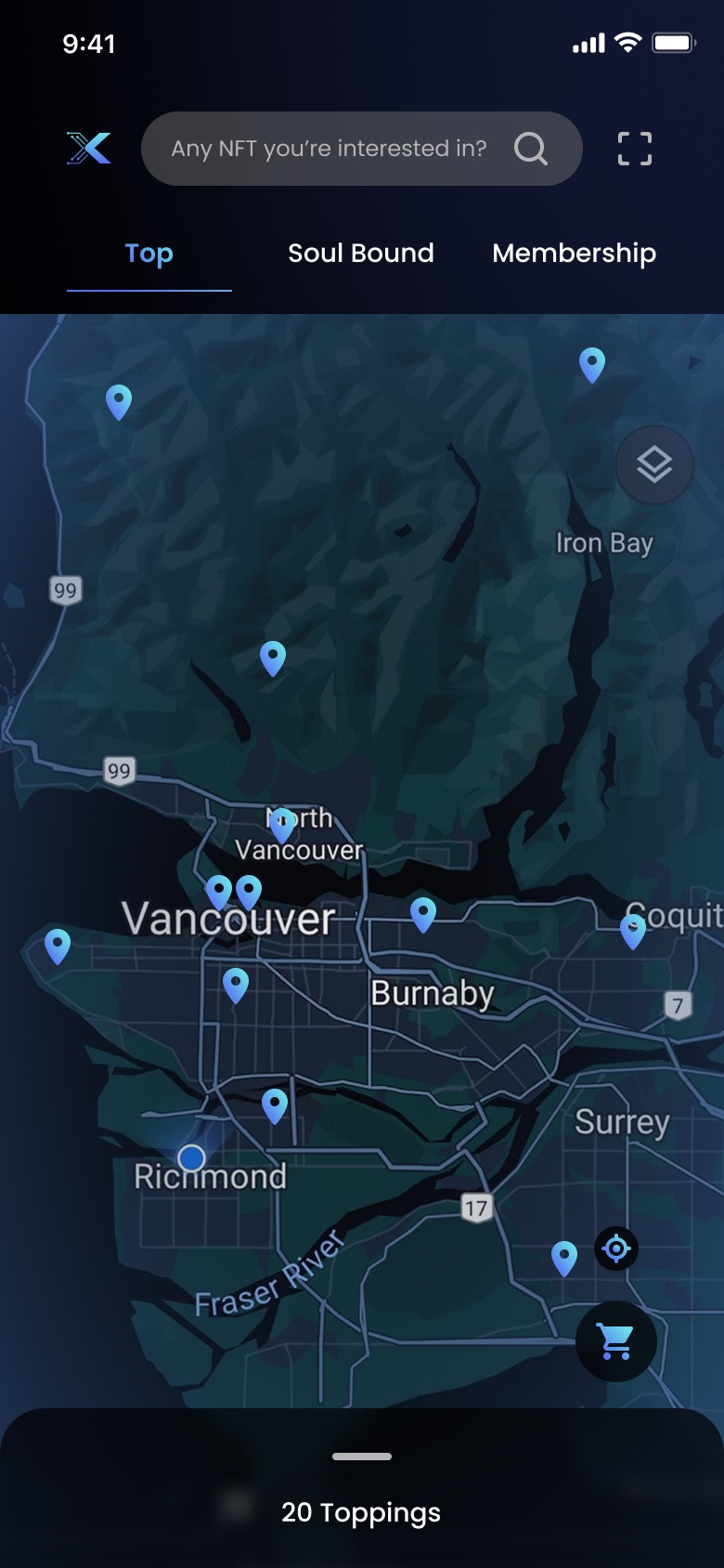
And so does the marketplace.

The floating Map button rides above every scroll position in both halves of the app, so it never costs you a step backwards to ask where is this? For a product whose entire premise is that tokens have addresses, that question had to be answerable from anywhere.

NFTs on the map

Moment 04 — Owning it without the vocabulary

Owned, unclaimed, made by you.

The library splits three ways — My Tour, My NFT, My Creation — and My NFT splits again into Owned and Unclaimed. A gift someone sent you that you haven't opened is a real state, and naming it is how you avoid the word wallet entirely.

Owned and unclaimed NFTs

Priced in both currencies, always.

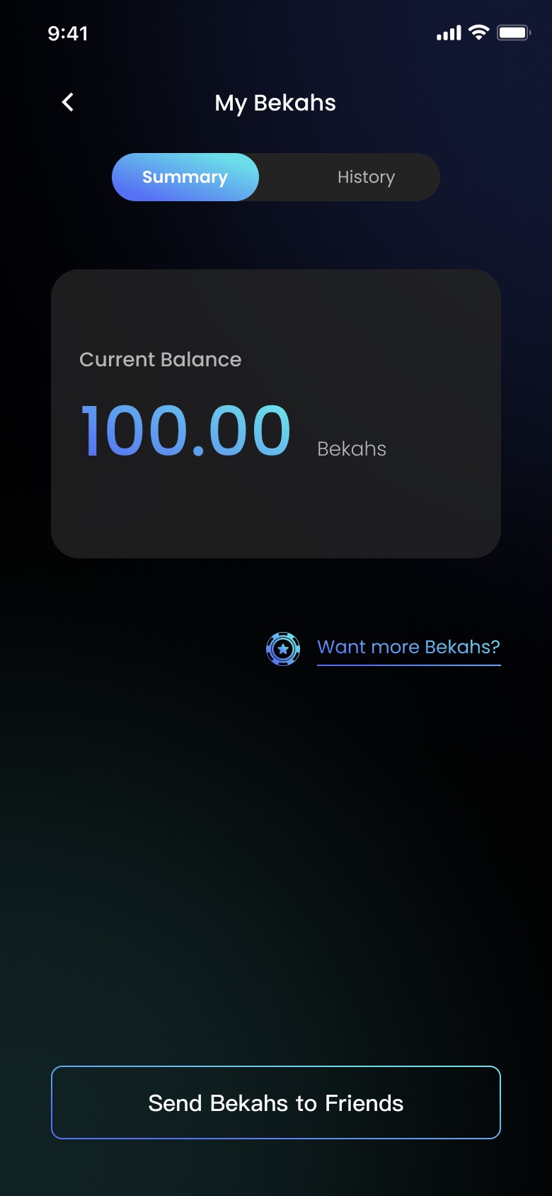
Bekahs are Jonathan's internal points, and every price in the product is written B/$ — so someone who has never bought a point can still read what a thing costs. Balance, history, and one outlined button to send some to a friend. The social layer is the reason to hold them; it isn't a wallet, it's a way of giving somebody a walk.

My Bekahs

04 / The system

Black, with the lights left on.

The ground is true black. Depth comes from soft coloured light behind the content — teal low on the left, blue up top, violet on the marketplace side — instead of from panels, borders and grey steps.

That choice is why photographs of mountains and whale artwork can sit edge to edge without a container: the glow does the separating. This page is standing on the same lights — the orbs drifting behind everything you have scrolled through are lifted straight out of the screens.

  • #000000 Void The ground. Not near-black — actually black, so the glows have something to read against.
  • #0C122A Blue light Where the top of a screen lifts. Never a fill — always a glow.
  • #0C1E1E Teal light The lower-left warmth on the guide side of the app.
  • #68D8E8 Cyan Start of the gradient, and the colour of anything currently selected.
  • #5898E8 Blue End of the gradient. Also every link, on its own.
  • #9030A8 Violet Borrowed from the artwork. It lights the marketplace and nothing else.

One gradient, one job.

Cyan to periwinkle appears on exactly one thing per screen: the action you are meant to take. Add to Cart. The selected segment. The download.

Everything else is an outline or plain text — so the gradient never has to compete with itself, and a screen can be read in one glance even in the dark. Search sits in frosted glass rather than a solid field, for the same reason: on black, a filled input reads as a button.

Primary
  • Gradient primary button
    Primary — gradient
  • Outlined secondary button
    Secondary — outline
  • Segmented control
    Segmented — selected
  • Frosted glass search field
    Search — frosted

05 / Every screen

The delivered file runs to eighty-two frames across five flows; this is the load-bearing forty. Each row scrolls sideways — use the arrows, drag it, or let it drift as you scroll. Click any screen to open it full size.

01Getting in & the tours 13 screens
02The marketplace 13 screens
03Ownership, points & people 14 screens

06 / Handoff

Four months, one designer.

Jonathan brought the logo, the name Bekahs, and the Soul Bound classification. Everything else — the information architecture, the four-tab model, the visual system, the map styling, the tagline and every word on every screen — came out of those four months.

Eighty-two frames is what it costs to design a product that is two products wearing one tab bar.

  • 4 months
  • 82 screens
  • 5 flows
  • 1 designer
On outcomes

The design was delivered in April 2023 and a development team built from it. I can't confirm it ever shipped — I have never found it in an app store. So there are no metrics on this page, only decisions and the reasoning behind them.

What I'd want to know

  • 01Does the audio-first default hold, or does everyone go straight to the marketplace tab anyway?
  • 02Does anyone actually use My Creation, or is authoring a tour a feature for the operator rather than the traveller?

What it taught me

Knowing nothing about NFTs was an advantage, not a gap — I was a better proxy for the first-time user than an expert would have been. And in the end the chain was a backend detail. Every decision that mattered was about a place, a price, and whether you could still hear the guide underground.

Walk the prototype Back to beyond work