Case study 03/Fantuan/Web ordering · End to end
Turning a page about a delivery service into the place the order actually happens.
- Role
- UI/UX Designer — end to end
- Scope
- UX · UI · Visual design · Web ordering
- Flow
- Homepage → merchant → dish → cart
01 / Context
A website that could not take an order.
Fantuan is a North American online food ordering and delivery platform, built around Chinese-diaspora communities.
I designed the web ordering experience for it — the homepage a visitor lands on, the merchant page where they choose, and the path from a single dish to a basket.
This page walks through four decisions in that work — what the early direction proposed, and what changed before it shipped.
02 / The starting point
A marketing site, not a store.
The website existed to introduce Fantuan and hand people to the app. Everything a customer actually wanted to do happened somewhere else.
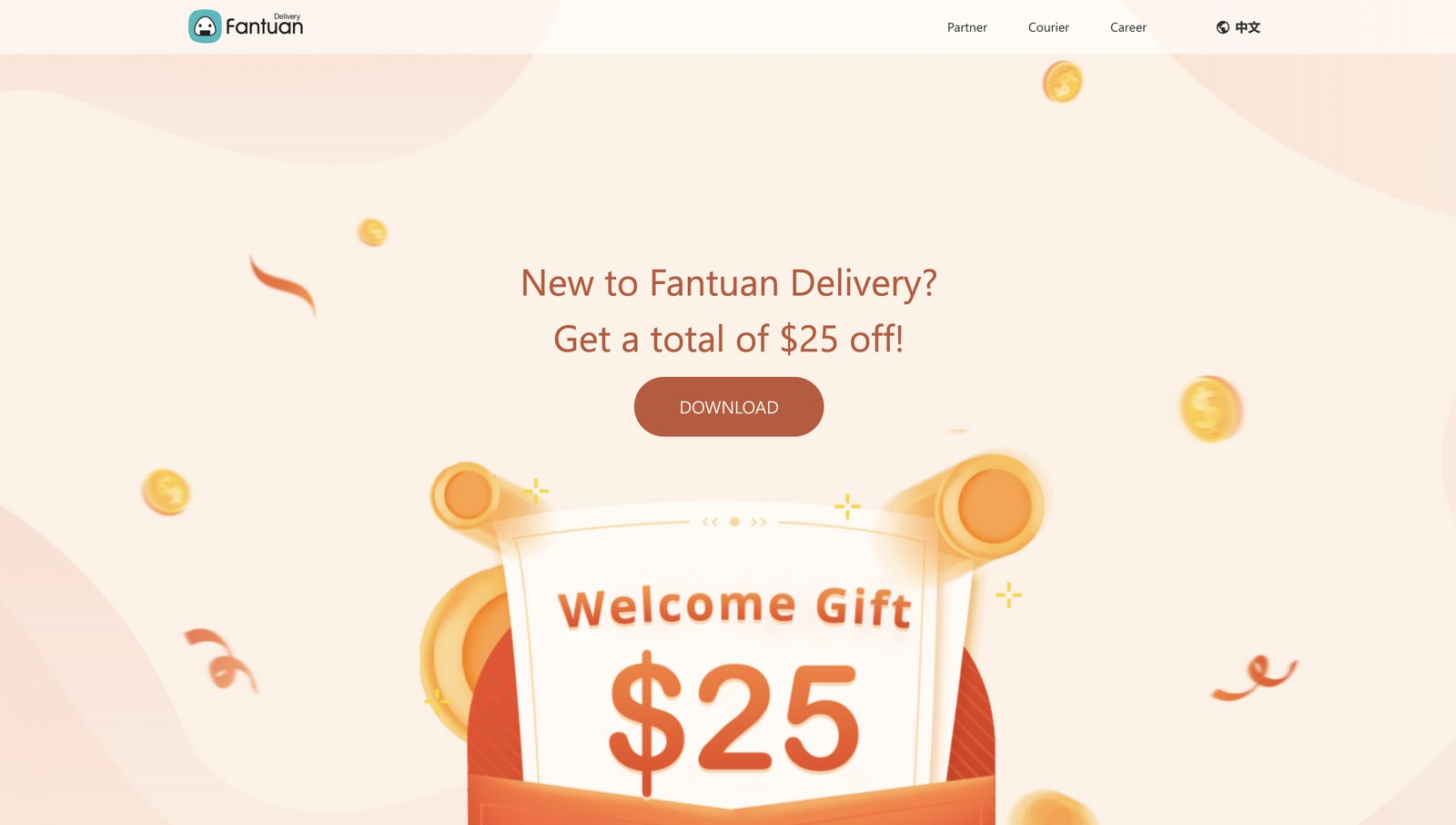
- 01 No way to place an order The first screen paired a welcome offer — a total of $25 off for new users — with a DOWNLOAD button. The order itself happened in the app.
- 02 What the page could do It could introduce the service, hand out a welcome offer and send you to the app. It could not show you a merchant, a menu or a price.
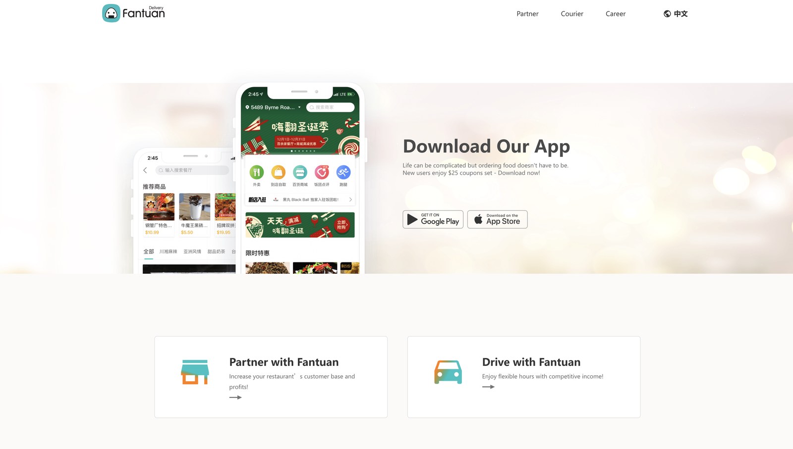
- 03 Three audiences, one page A "Download Our App" section sat with Partner and Drive cards for merchants and couriers. Three audiences shared one page, and the customer's action on it was a download.
What the early direction proposed
How I worked
- Flow walkthrough Every screen, in order, at one fixed frame. I stepped through the whole ordering path — homepage, merchant page, dish, basket, checkout — in a 1440 × 820 viewport, marking every point where the interface asked for something at the wrong moment, or kept showing a value it could no longer stand behind.
- Competitive benchmark What the category had already settled. For each of those moments I checked how Uber Eats, DoorDash and Fantuan’s own app handle it. Where three of them agree, the burden of proof is on differing. Where they disagree, the call is genuinely mine to argue.
- Operations constraint What the business needed to be true. Delivery, pickup and dine-out do not cost the same to serve, and seasonal campaigns still had to run somewhere. Two of the four decisions below are shaped as much by that as by the flow itself.
On evidence
Only one of the four decisions went out as a controlled experiment, and its design and results are reported where it appears, as relative change. The other three are argued from the flow, from the patterns the category had settled, and from what operations needed to be true — so for those I report what changed on the screen, what it cost, and the number I would want in order to find out whether I was right. Where there is no measurement, I say so rather than implying one.
The direction was to turn a page about the service into the place where the service happens.
03 / Decision one
From brand showcase to catalogue.
The early direction spent the prime first-screen slot on two illustrated brand banners set side by side: a back-to-school promotion and a new-area announcement. The merchant grid started underneath them.
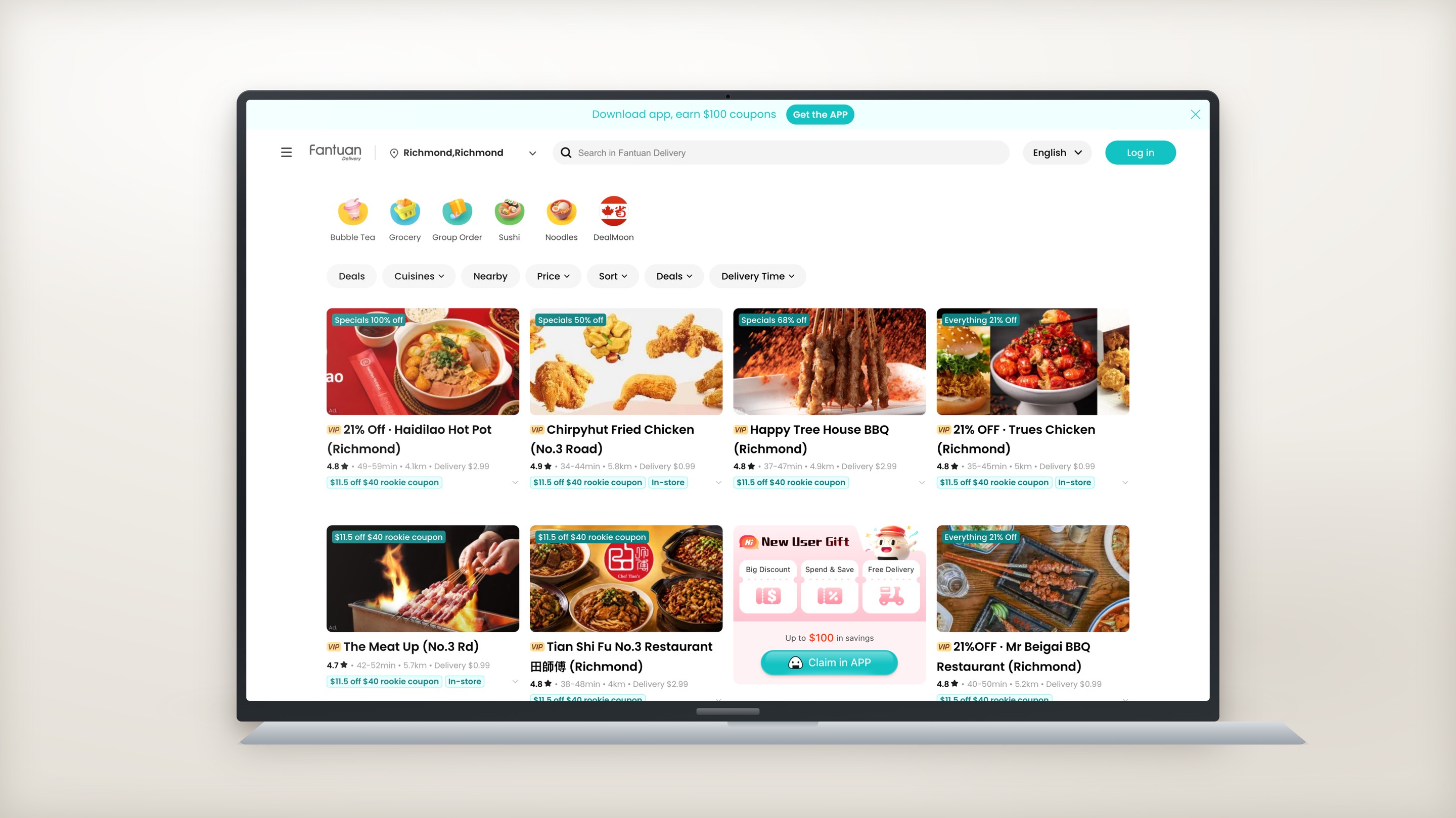
The shipped site deletes that band. The promotion becomes one ordinary cell inside the grid, the category rail shrinks from photo rectangles to circular icons, and the grid widens from three columns to four.
I designed on the assumption that someone opening a delivery site already knows they want food. On that assumption the first screen has one job: show what is orderable right now.
How I found it
- Flow walkthrough The first screen never showed a whole merchant. Measured in a 1440 × 820 frame, the two brand banners pushed the first merchant card about 580px down. Three merchants reached the fold, and their coupon chips — the thing that actually separates one from another — were cut off.
- Competitive benchmark Nobody in the category opens on a banner band. Uber Eats, DoorDash and Fantuan’s own app all open on inventory. The category had already decided that the first screen of a delivery site is a catalogue, not a cover.
- Operations constraint The campaigns could not simply be deleted. Seasonal promotions and cuisine merchandising still had to run somewhere. So the question was never whether to keep them — it was which surface each one had earned.
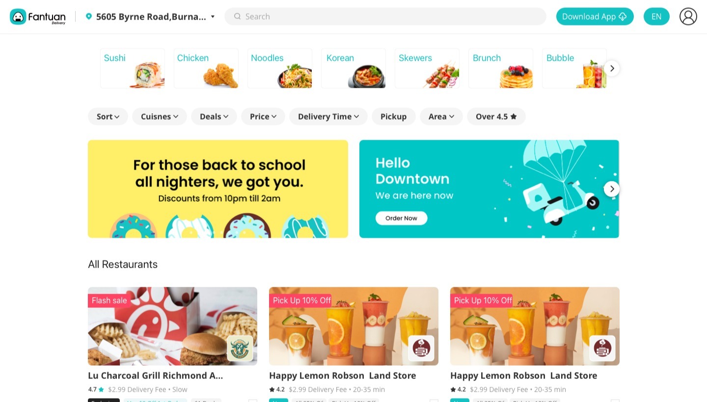
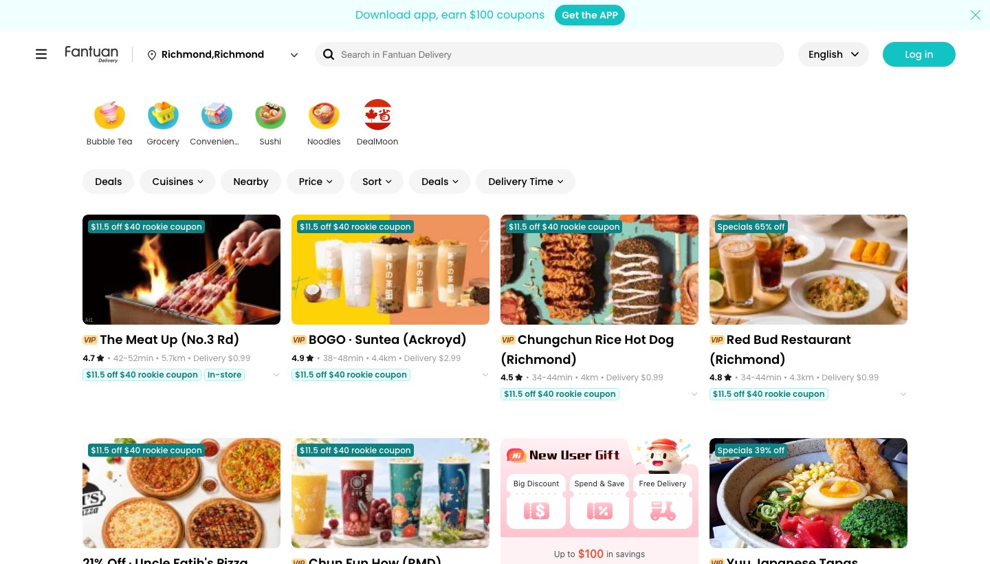
The brand content was not deleted. It moved to where the intent already is.
Design response
Give the first screen a single job — show what is orderable right now — and re-home the brand content on surfaces the visitor opens deliberately: the campaign as a refreshable tag in the search panel, the cuisine photos inside the Cuisines popover.
From interruption to on-demand
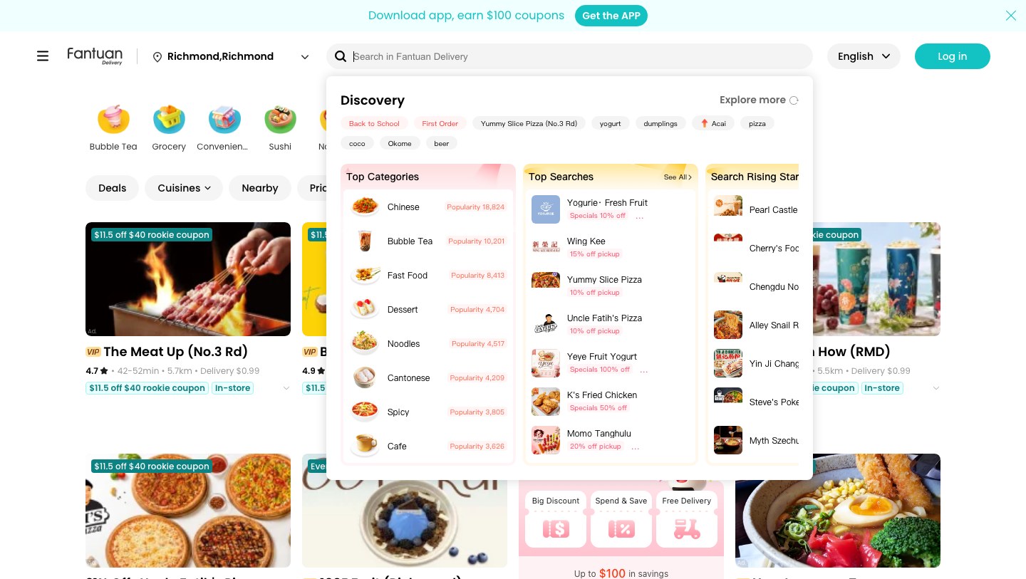
The shipped site runs the same kind of seasonal campaign as a "Back to School" tag, inside the refreshable tag row that opens the moment someone clicks search.
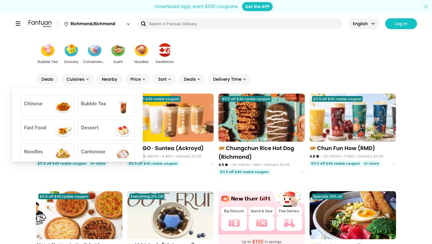
The photo cuisine cards moved rather than disappeared. They sit inside the Cuisines popover, one click away, where the visitor has already said they want to filter by cuisine.
Same kind of content, different trigger. On the homepage it interrupts an order. Behind search and filters it answers a question the visitor has just asked.
Where it went — shown on intent
Caveat
Back-to-school is a seasonal campaign. So the tag and the banner are the same kind of campaign given a new position, not the same asset carried across. What repeats is the placement rule, not the artwork.
Density was the visible result. The move underneath it was deciding which surface each piece of content had earned.
Why I took it anyway
This is the decision I would most want a split test on — campaign engagement against orders started. If campaign clicks fell without a matching rise in orders begun, the banner band has earned its slot back, and I would give it one.
What it changed
Eight merchants reach the first screen instead of three, four of them complete with their coupon chips intact. The first merchant card now starts about 313px down rather than about 580.
Neither piece of brand content was deleted. Both sit one click behind a control the visitor uses to state what they want.
Same content, different trigger. That is the whole argument — the homepage stopped paying for reach it was not converting.
04 / Decision two — Fulfilment
A checkout toggle became a priced choice.
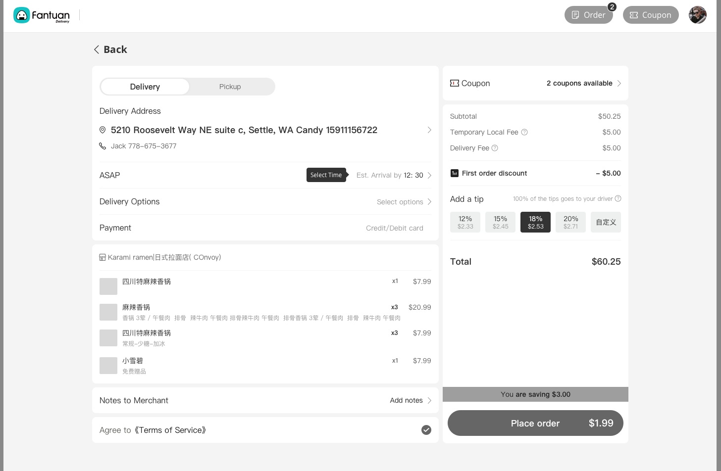
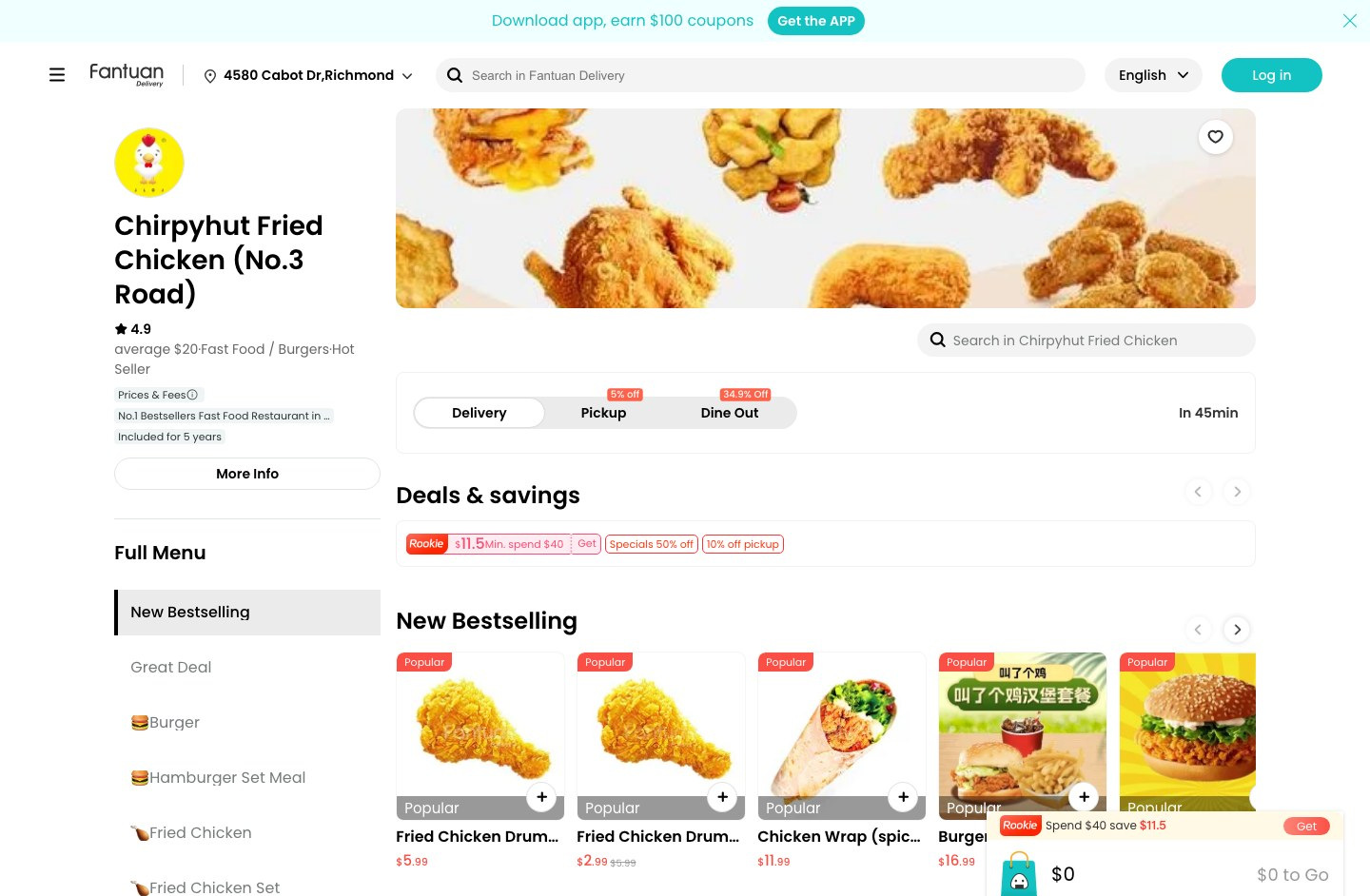
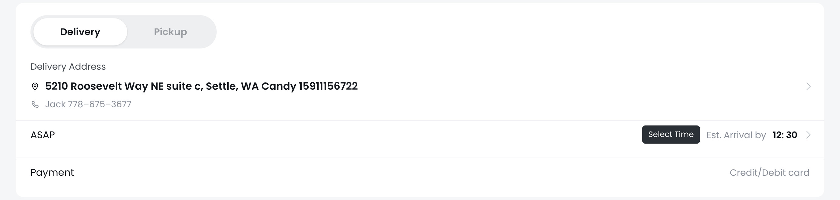
The early direction was not missing a fulfilment switch. It had one — a Delivery | Pickup toggle on the order page, at checkout, sharing that screen with the delivery address, the itemised basket and the tip selector. Neither side of it carried a price.
Everywhere earlier in the flow, fulfilment was something the page mentioned rather than something the user set: a Pickup chip in the homepage filter row, a grey Pickup Available tag on the merchant card, and read-only delivery and pickup text on the merchant page itself.
So the choice existed. It was simply asked last — after the basket had already been built around the assumption of delivery — and it was asked for free.
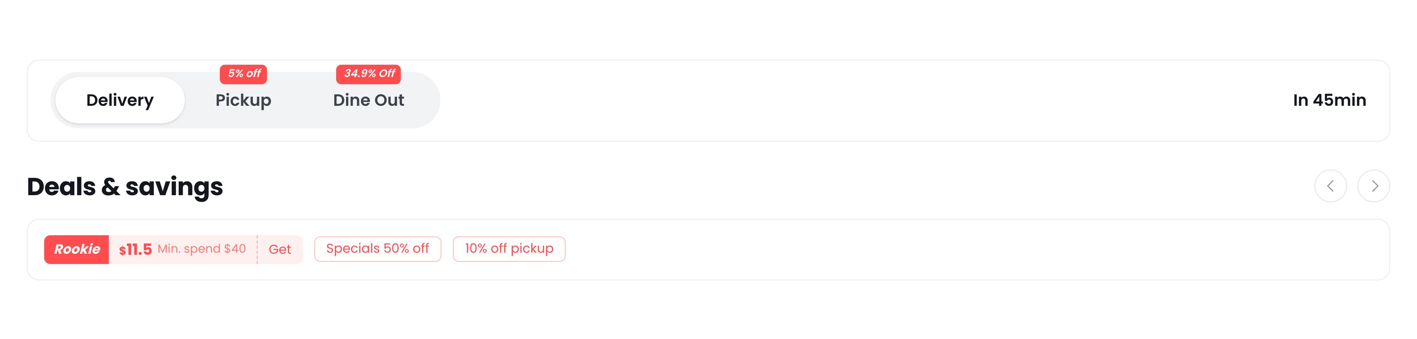
The shipped site asks it first, on the merchant page, before a basket exists — and prints what each answer is worth.
How I found it
- Flow walkthrough The choice existed — it was just asked last. Fulfilment appears four times in the early flow: a Pickup chip in the homepage filters, a grey Pickup Available tag on the merchant card, read-only text on the merchant page. It is only settable at checkout, after the basket has been built around delivery.
- Competitive benchmark Every major app asks before the basket. Uber Eats, DoorDash and Fantuan’s own app all put the fulfilment switch above the menu, not inside checkout. Asking after the basket turns changing your mind into a re-do.
- Operations constraint The three modes do not cost the same to serve. Pickup and dine-out skip the courier entirely, and merchants discount them to move demand toward those modes. That only works if the number reaches the user before they commit.
Where the control sits — whole page, same scale
The control itself — both redrawn to scale in one frame
Design response
Move the fulfilment decision off the order page and onto the top of the merchant page, where the user is still choosing, and let each mode's discount ride on the switch itself rather than live in a promotion elsewhere.
What actually moved
Business surface
The three modes are not equally cheap to serve, and the switch says so out loud. On the merchant page I captured, the unselected options read 5% off for pickup and 34.9% off for dine out, while delivery carries no number at all. The figures are that merchant's; the pattern is the control's.
Because the number sits on the option not yet taken, it reads as an offer rather than as a receipt — and it arrives at the exact moment the user decides how to get the food, not in a promotion somewhere else on the page.
Asked at checkout, fulfilment is a shipping detail. Asked on the merchant page with a number on it, it is the first real decision of the order.
Why I took it anyway
That was the number the test was built to answer: delivery volume against total orders. Delivery’s share did fall — four points, precisely what pickup and dine out gained between them. But the switch did not simply move the same orders around. Conversion rose faster than order value fell, so the frame paid for itself in orders placed rather than in basket size. The figures are below.
What it changed
Fulfilment stopped being a shipping detail and became the first real decision of the order. Because it is asked before a basket exists, changing it costs nothing — where the early direction made it a re-do.
The price of each mode arrives at the moment that mode is being chosen, rather than at the end of the flow in a promotion panel.
And a two-way toggle became room for a third option the early direction had nowhere to put.
What it changed — measured in a controlled test
| Metric | Change | What it is |
|---|---|---|
| Merchant page → paid order | +18.75% | Relative lift in the share of merchant-page visits that ended in a paid order |
| Checkout abandonment | −5.0% | Relative drop — fewer people reached checkout and then left |
| Delivery share of orders | −4pp | Percentage points, moved to the two cheaper modes |
| Pickup share of orders | +2pp | Half of what delivery gave up |
| Dine Out share of paid orders | +2pp | A mode the early direction had no place for |
| Average order value, after discount | −1.0% | The discounted basket is smaller — the measured cost of the frame |
| Revenue per merchant-page visit | +17.6% | Conversion multiplied by order value — what a visit is actually worth |
How it was tested
Figures are given as relative change and percentage points rather than as absolute rates, because the underlying numbers are the company’s.
A delivery funnel became an entry point to three priced modes.
05 / Decision three
The modal stopped being the only way in.
The early direction treated the menu as homogeneous. Every item, however simple, required opening a modal — a no-option drink and a build-your-own bowl took the identical path.
Its dish card carried no add control at all. Name, price, a stock tag, a thumbnail. The only way in was the modal.
So the modal was never really a configuration surface. It was the only way to add anything at all.
How I found it
- Flow walkthrough One path for every dish, however simple. A canned drink with nothing to choose and a build-your-own bowl took the identical route. The dish card carried no add control at all, so the modal was not a configuration surface — it was the only way in.
- Competitive benchmark The category splits the path. Uber Eats adds simple items straight from the card; DoorDash shows a + only where nothing is required. Both had already concluded that the modal is for configuring, not for adding.
- Merchant data Option data is uneven. Not every merchant fills in which dishes have required options. That single fact rules out deciding per card which items deserve a button — and it shapes the trade-off below.
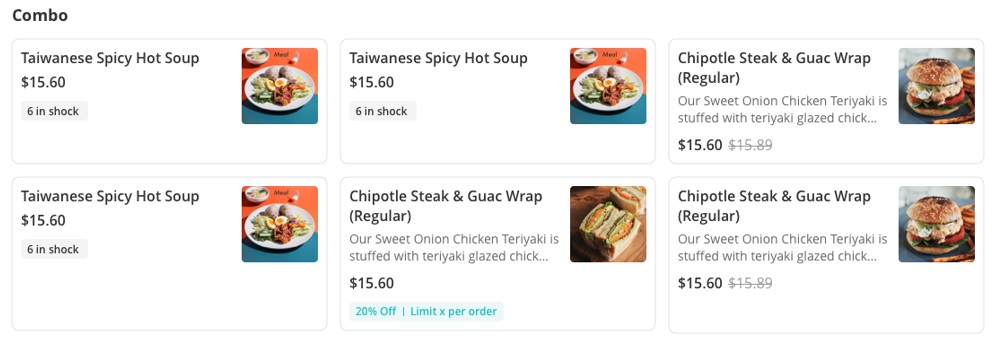
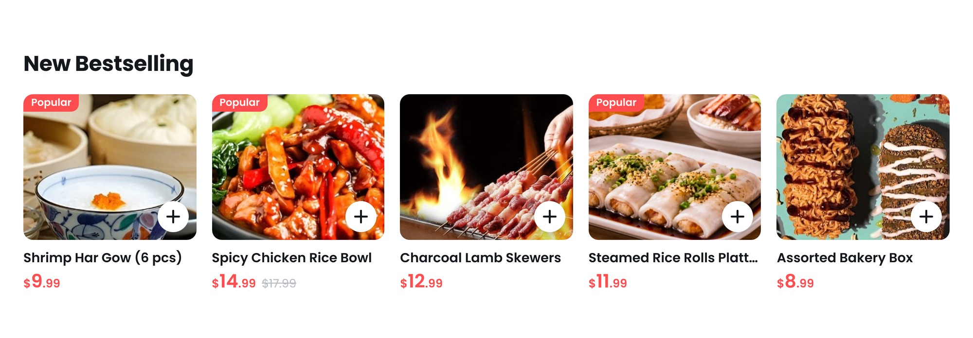
One + on every card, and two different things behind it.
The glyph is identical on both. In the New Bestselling carousel, a burger set meal and the single dishes beside it carry exactly the same button.
The enabling condition
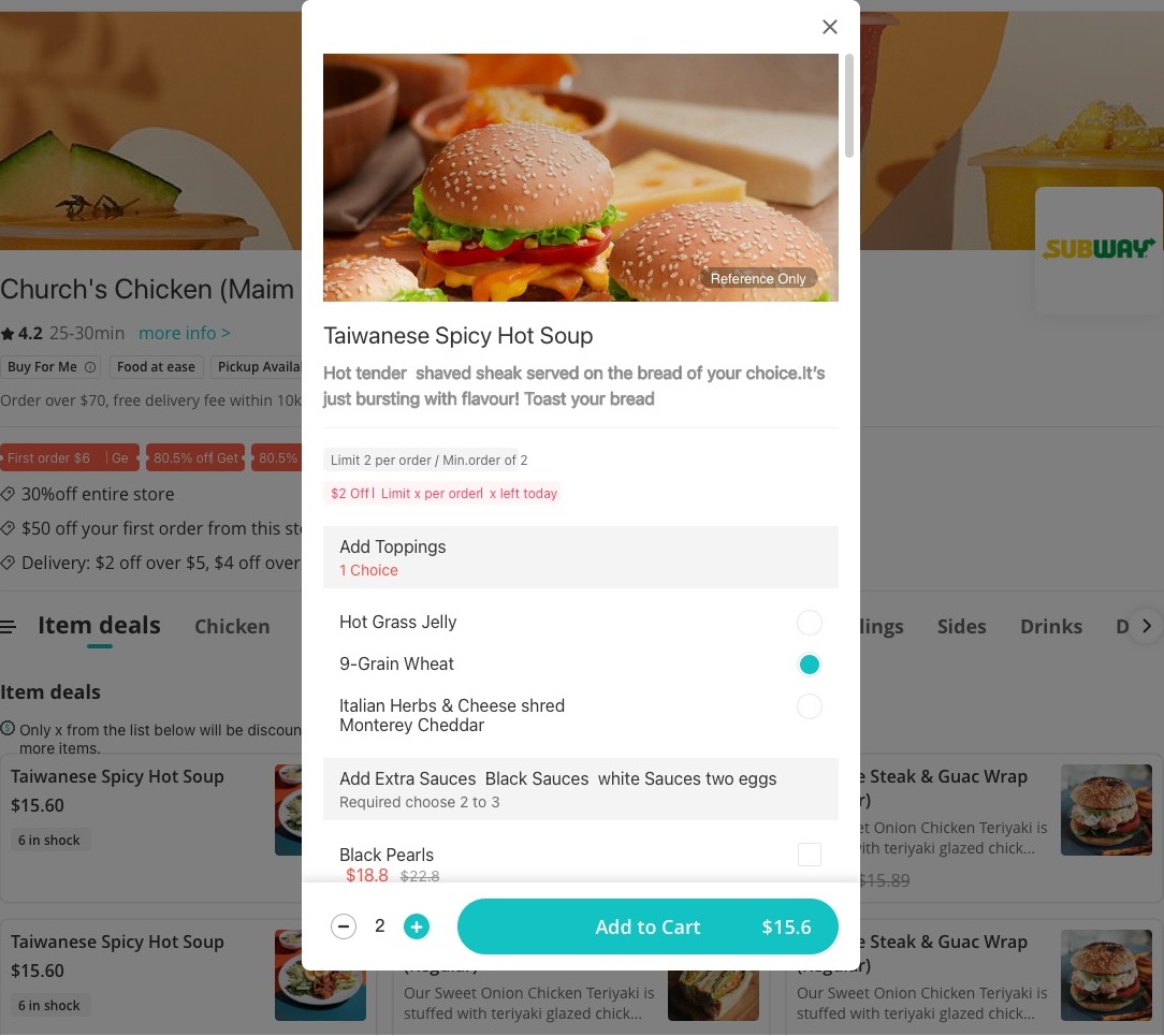
A direct add is only safe if the user is told it happened. In the early direction nothing on the page could tell them. The merchant page had no cart at all.
So that modal was quietly doing two jobs. It configured the item, and its Add to Cart button was also the only proof that anything had been added.
That double duty is exactly why that direction could not drop the modal. Reassigning confirmation to a persistent cart is what freed it to serve real configuration only.
Design response
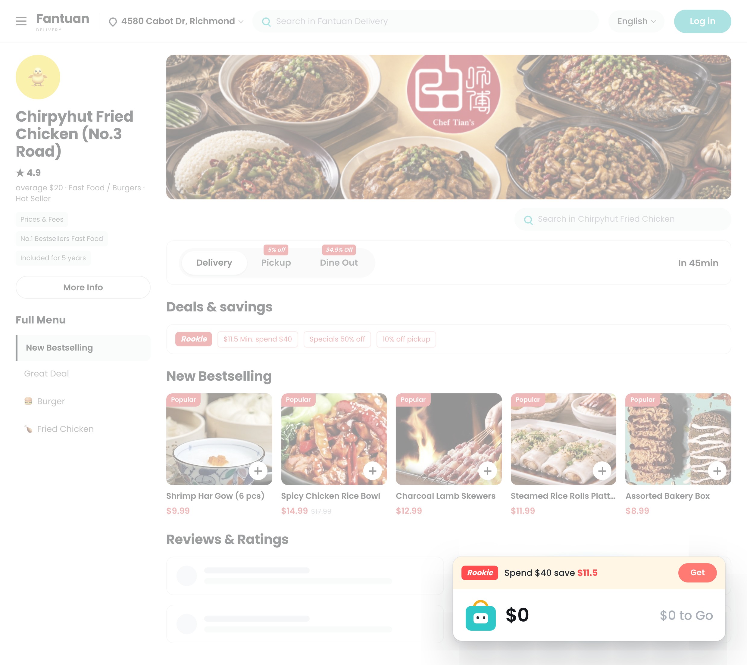
Moved confirmation out of the modal and into a cart that never leaves the screen. Both branches now report to the same place, so the modal only has to do the job it is good at.
DoorDash avoids this by showing + only on items with no required options, so the presence of the button is itself the signal. That is a cleaner promise, and it is the version I would test this one against.
Why the unified + still holds
The cost is real. The card cannot tell the user which branch they are about to take, and I chose it anyway — a distinct treatment for configurable items is still the first thing I would test.
What it changed
A drink now takes one tap instead of three. The modal still opens, but only for dishes that actually have something to configure, so it stopped being a toll and became a tool.
The persistent cart is what made the short path safe, and it earned its place twice over: it confirms every add, and it carries the spend-and-save progress that the early direction had no surface for.
The modal was never the problem. Being the only door was.
06 / Decision four
Matching modality to the weight of the decision.
The address selector looks like a filter. It is not. It decides which merchants appear, what the delivery fee is, how long the food takes, and whether an order is possible at all.
The early direction opened it as a dropdown anchored under the header — the same shape the interface used for skimming a search history.
It landed on top of the category rail and the filter bar, the exact content a new address was about to refresh. Everything further down the page stayed fully lit — merchant cards still reading “$2.99 Delivery Fee · 20-35 min”, a fee and an estimate that belonged to the address the user was in the middle of replacing.
Inside the panel: two saved addresses, the second one wrapping onto a second line instead of truncating, in a fixed-height box that left roughly 60% of itself white. Nothing at the bottom edge. If neither of the two was the right one, the panel was a dead end.
A dropdown reads as glance and dismiss. A masked modal reads as settle this, because everything below it depends on the answer.
The shipped design makes it a centred modal over a full-page mask. While the address is unresolved, nothing behind it reads as current, and the panel ends in a sticky Add New Address.
How I found it
- Flow walkthrough The overlay’s shape contradicted its stakes. The early dropdown covered the category rail and the filters, and stopped. Every merchant card below it stayed fully lit, still quoting a delivery fee and a time that belonged to the address being replaced.
- Pattern audit The same tell appeared twice in the file. Address and search were both fixed-height boxes roughly 60% empty, one of them wrapping an address onto a second line rather than truncating it. That is the signature of designing the container before the content.
- Competitive benchmark Address takes over the screen everywhere it matters. Uber Eats and DoorDash both make it modal, and both end the panel in an add-new action. The dead end was the sharper failure — the dropdown shape was only the symptom.
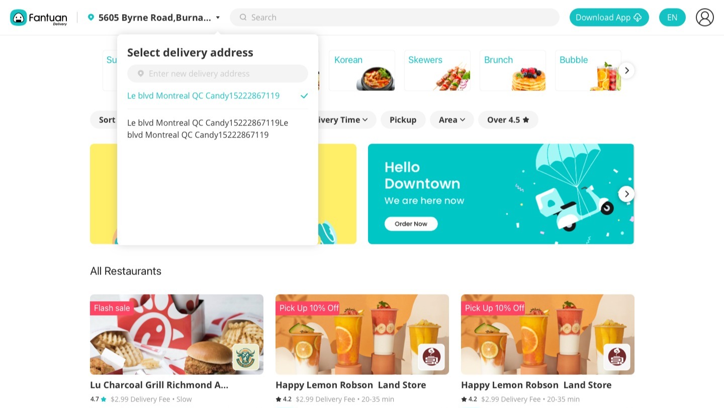
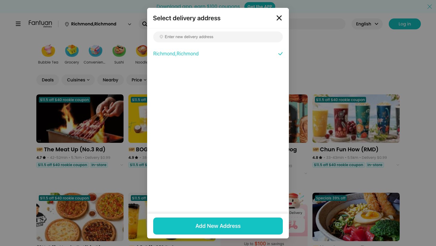
- 01 The shape now matches the weight. A decision this consequential gets a form that asks the user to finish it, not glance at it.
- 02 Covering the whole page is the honest move. The early dropdown hid the rail and the filters while leaving the cards below it lit, fees and delivery times intact. Dimming all of it says plainly that all of it is about to change.
- 03 The panel always offers a way out. Where the early panel could only list the two addresses it already knew, the shipped one ends in Add New Address.
Design response
Match the modality to the stakes — a centred modal over a full-page mask, so nothing behind it still claims to be current — and end the panel in a sticky Add New Address, so it always offers a next step instead of a dead end.
Why I took it anyway
The refinement, not the reversal: show the current address in the header itself, so the confirm-only case never has to open anything. That takes the glance out of the modal rather than making the modal lighter.
What it changed
While the address is unresolved, nothing behind it reads as current — so the page can no longer quote a fee and a delivery time for a place the user is in the middle of leaving.
And the panel now has an exit. Where the early one could only list the two addresses it already knew, the shipped one always ends in Add New Address.
The shape of an overlay is a claim about how much the answer matters. This one was making the wrong claim.
The same tell
Both early overlays were fixed-height containers. The address panel held two saved addresses, one of them wrapping onto a second line, and still left roughly 60% of itself empty. The search panel held four entries and was mostly white.
That is the signature of designing the container first and dropping sample content into it.
The shipped panels start from the data instead — sized around real content, with the primary action pinned to the bottom so the space always ends in a next step.
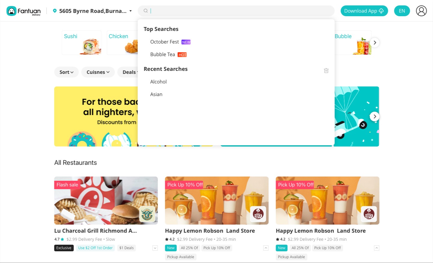
This is the habit I most wanted to break — design from what the data actually is, not from a container that looked right.
07 / Still open
Four things I would change — and one I would keep.
A shipped product keeps its open questions. These are the ones I would pick up first — four I would change, and one from the early direction I would bring back.
- 01 One plus sign, two outcomes On a dish that has customisable options the plus opens the configuration modal; on a dish that has no options it adds straight to the cart. The glyph looks the same either way, so nothing on the card tells you which is coming. I would test a distinct treatment for the configurable ones.
- 02 Two Deals chips in one filter row The live filter row carries Deals twice. It is small, it is real, and it is the kind of thing that only stays fixed if one owner holds the row.
- 03 Badge colour stacking across the cards Teal coupon badges and dark specials badges land on merchant cards, with a VIP prefix on the name, and red Popular flags do the same job one level down on dish cards. Each earns its place alone. Together they flatten the hierarchy they were built to create.
- 04 A welcome gift before the first merchant A first-time visitor meets $100 in coupons before a single restaurant. The offer is real, but it spends attention the page has not earned yet. I would try it on the first scroll instead.
Worth carrying forward
The early direction designed three merchant states — On Break, with pre-order copy and the time delivery restarts; Closed; and Busy. A dimmed card that offers a pre-order keeps the visit alive instead of ending it, and that idea deserves to survive into the live product.
08 / Takeaways
What this left me with.
These are the four positions I argue from now. Each one came out of a specific disagreement with my own earlier draft.
-
01 The first screen belongs to whatever the user came for. Intent before introduction
Brand content does not have to be deleted to stop blocking the catalogue — it has to move. The banner band went. The same kind of seasonal campaign now surfaces as a tag inside search, and the photo category cards became a popover opened on demand.
-
02 A control that carries a price is doing commercial work. Price where the choice happens
Fantuan prices Delivery, Pickup and Dine Out differently. The design decision was to print that discount on the options the user has not chosen, which turns a mode switch into a pricing surface and makes the case for the cheaper mode at the exact moment someone decides how to get the food.
-
03 Find out what a component is secretly doing before removing it. Every pattern has a second job
The early dish modal looked like a configuration step. It was also the confirmation that a tap had registered, which is why that draft could not simply drop it. Adding straight to the cart only became safe once a persistent cart took that second job over.
-
04 Modality is a promise about consequence. Interrupt in proportion
A dropdown reads as glance and dismiss. Address is global state, changing which merchants, which fees and which times a user sees, so a masked modal is the honest container. Match the interruption to how much the decision changes.