Case study 04/Properate/Website · IA · Design system
Transforming a fragmented product into a guided decision-making experience
- Role
- Lead UI/UX Designer
- Scope
- UX Strategy · UI Design · Design System
- Timeline
- 9 months
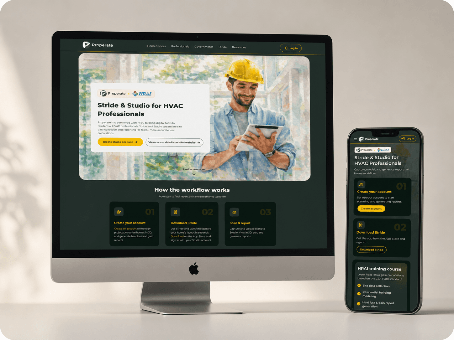
01 / Context
A product that outgrew its own website.
Properate is a platform that helps homeowners, professionals, and governments plan and execute home energy upgrades.
As the product evolved into a multi-audience platform, the website failed to reflect its complexity, value, and user journeys.
Instead of guiding decisions, the experience presented fragmented tools and disconnected information.
02 / The problem
Not a visual problem — a communication one.
The core issue was not only visual design, it was a mismatch between the product complexity and how it was communicated.
- 01 Unclear value proposition Users could not quickly understand what Properate offers, who it is for, or how to get started.
- 02 Fragmented user journeys Different audiences (homeowners, professionals, governments) were mixed together, with no clear entry points or guided paths.
- 03 Cognitive overload Dense content and competing elements made it difficult for users to prioritize actions.
- 04 Navigation misaligned with user needs Information was structured around internal categories rather than real user goals.
- 05 Lack of system consistency Inconsistent visual and interaction patterns reduced clarity and trust.
- 06 Weak conversion hierarchy Multiple competing CTAs diluted the primary action and created friction in decision-making.
Before the redesign — scroll each frame


Overall, the experience lacked clarity, structure, and a clear path to action.
Why this matters
Energy retrofit is not a simple task. It involves cost, policy, technical constraints, and long-term impact.
Without clarity, users delay decisions or abandon the process entirely. The website needed to reduce uncertainty and build confidence.
03 / Reframing the problem
Not a redesign. A re-framing.
While the initial issues appeared to be visual and structural, the deeper problem was a mismatch between how the product was organized and how users make decisions.
Instead of treating this as a website redesign, I reframed it as…
- 01 A decision-making experience problem
- 02 A multi-audience clarity problem
- 03 A navigation model misalignment problem
The goal shifted from improving pages to guiding users toward action.
04 / Information architecture
From one structure to a system.
The navigation evolved from a single, content-based structure into a multi-dimensional system:
This allows users to enter the platform based on their intent, not just their role.


05 / Key design decisions
Three moves that changed the model.
-
01 Introduced audience-based entry pointsProblemMixed audiences Unclear starting points Role confusionOutcome Help users quickly identify where to start.
-
02 Established a clear primary action per entryProblemCompeting CTAs Low trust Decision frictionOutcome Reduced competing CTAs and improved focus.
-
03 Designed guided flows for task completionProblemFragmented information Complex eligibility Disconnected stepsOutcome Shifted from browsing to action-oriented journeys.
06 / Designing the entry experience
Shifting the homepage from exploration to decision.
Shifting the homepage from content exploration to guided decision-making.

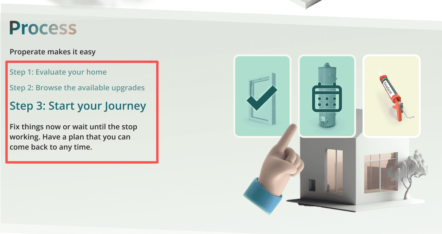

The shift
From browsing → guided action.


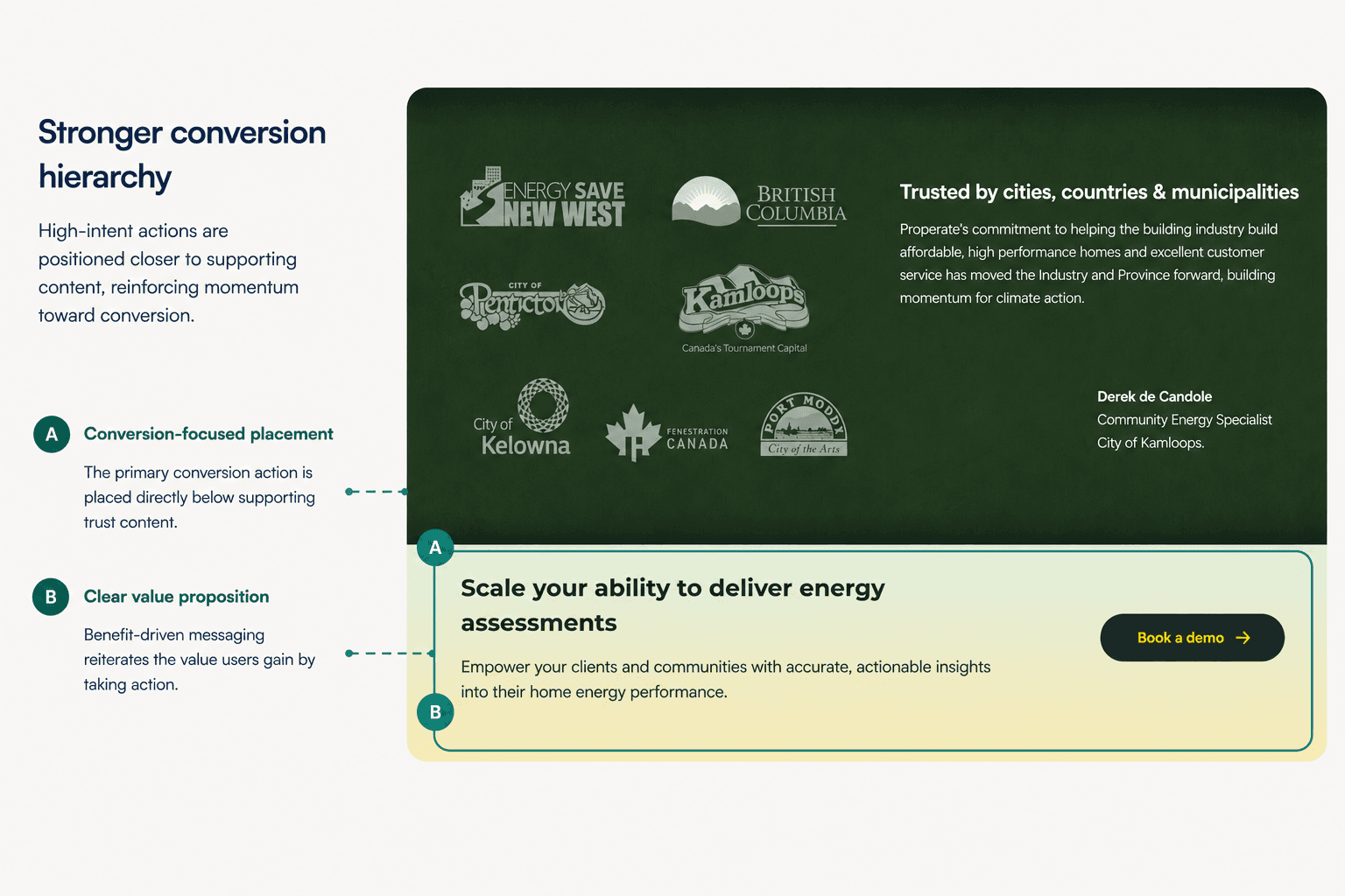
The redesign shifted the experience from information browsing toward guided decision-making and action.
07 / Design foundation
Building a scalable foundation.
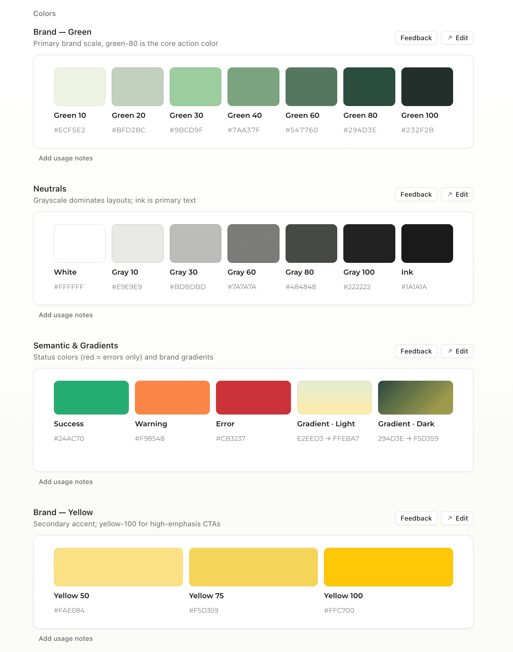
To support a growing multi-product platform, I created a reusable design library in Figma that standardized components, typography, colors, icons, and interaction patterns across the website.


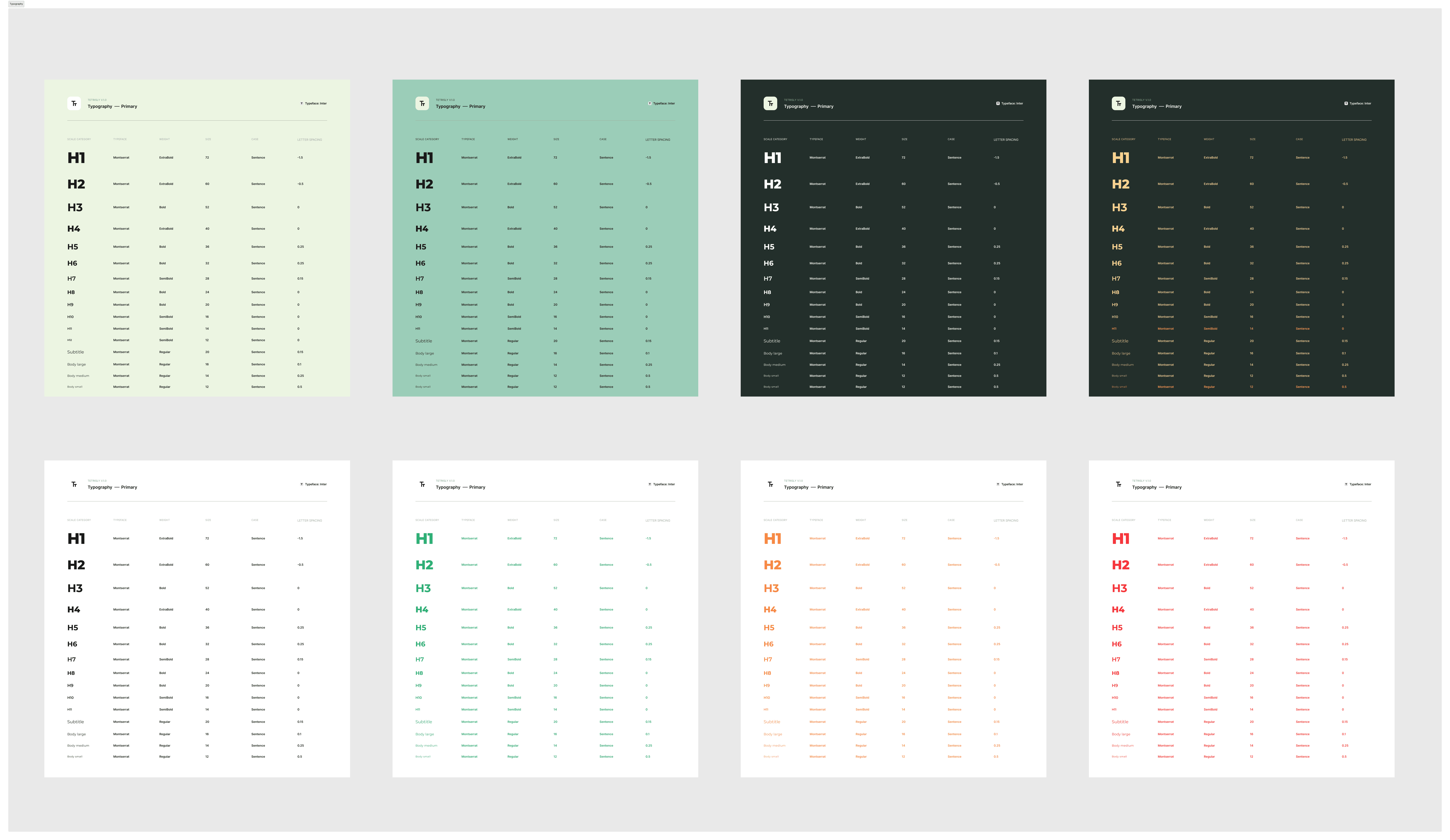

Extending the system
The library was later integrated into Claude Design, allowing AI-generated layouts to follow the same design language and component system.


08 / Final experience
One cohesive, scalable experience.
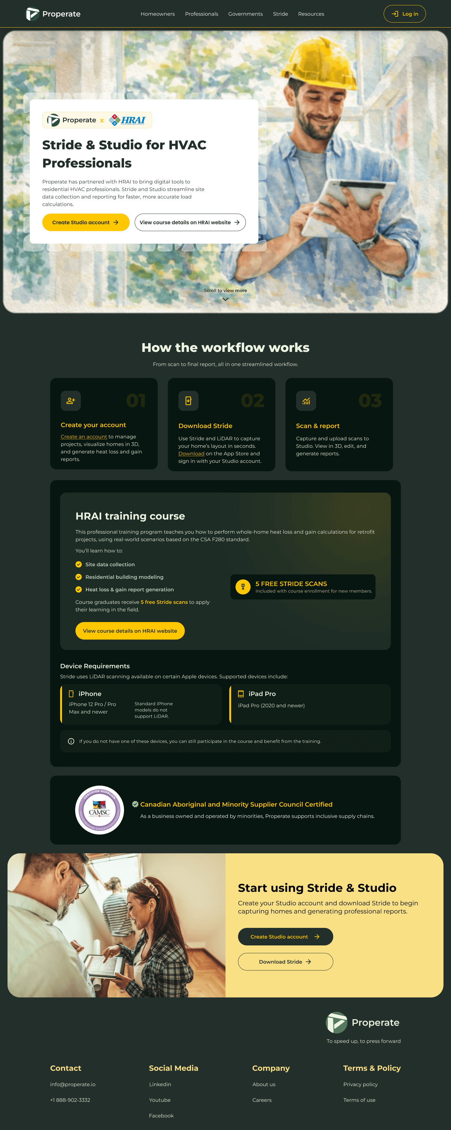
The redesign transformed Properate from a collection of disconnected pages into a cohesive, scalable experience that guides different audiences toward meaningful action.



Key takeaways.
This project reinforced that successful website redesigns go beyond visual polish. Clear information architecture, scalable systems, and intentional navigation are what enable users to understand products and make confident decisions.
-
01 Information architecture drives product understanding. Clarity begins with structure
A website's structure shapes how users understand a product. Organizing navigation around user goals rather than internal business categories made the platform easier to navigate and easier to explain.
-
02 Scalable systems reduce future design effort. Design once, scale everywhere
Building a reusable design library established a consistent foundation for future pages, accelerated iteration, and simplified collaboration across design and development.
-
03 Navigation is a product decision, not a visual one. Guide users, don't overwhelm them
The biggest improvement came from redefining entry points and user journeys rather than redesigning the interface. Clear navigation reduced decision friction and better connected users with relevant products and services.
If I had more time…
While the redesign established a strong foundation for Properate, there are several areas I would continue to explore to further validate and evolve the experience.